-

- Everyday Reflections in Abstraction, Exhibition view, SPACE, Irvine, CA

-
- Everyday Reflections in Abstraction, Exhibition view, SPACE, Irvine, CA

-
- Everyday Reflections in Abstraction, Exhibition view, SPACE, Irvine, CA
-
- Everyday Reflections in Abstraction, Exhibition view, SPACE, Irvine, CA
-
- Everyday Reflections in Abstraction, Exhibition view, SPACE, Irvine, CA
-
- Everyday Reflections in Abstraction, Exhibition view, SPACE, Irvine, CA
-
- Everyday Reflections in Abstraction, Exhibition view, SPACE, Irvine, CA

-
- Everyday Reflections in Abstraction, Exhibition view, SPACE, Irvine, CA
-
- Everyday Reflections in Abstraction, Exhibition view, SPACE, Irvine, CA

-
- Everyday Reflections in Abstraction, Exhibition view, SPACE, Irvine, CA
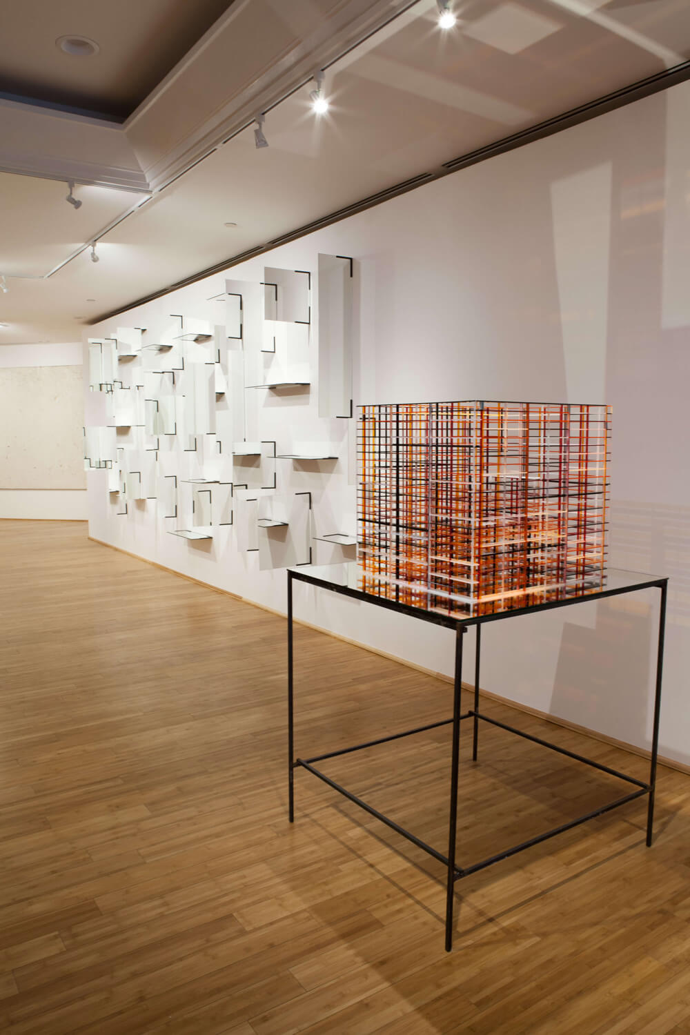
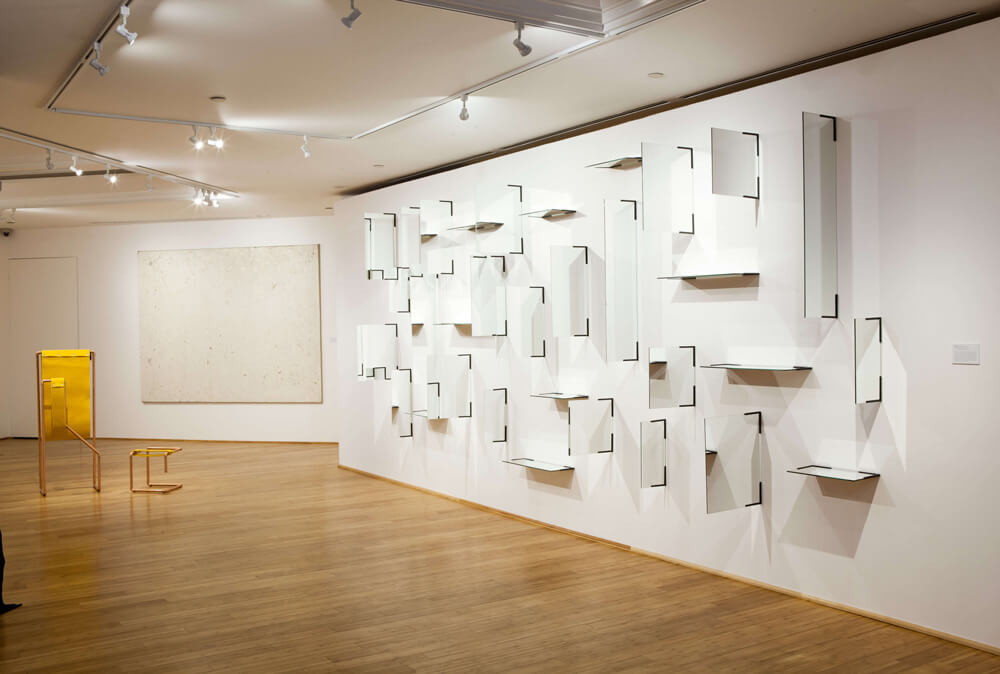
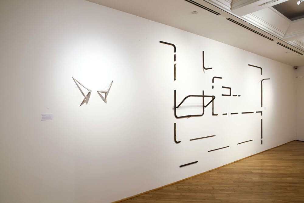
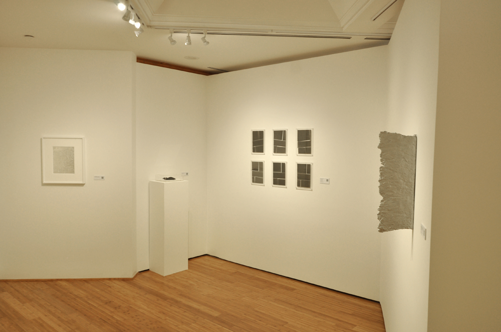
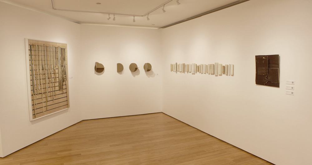
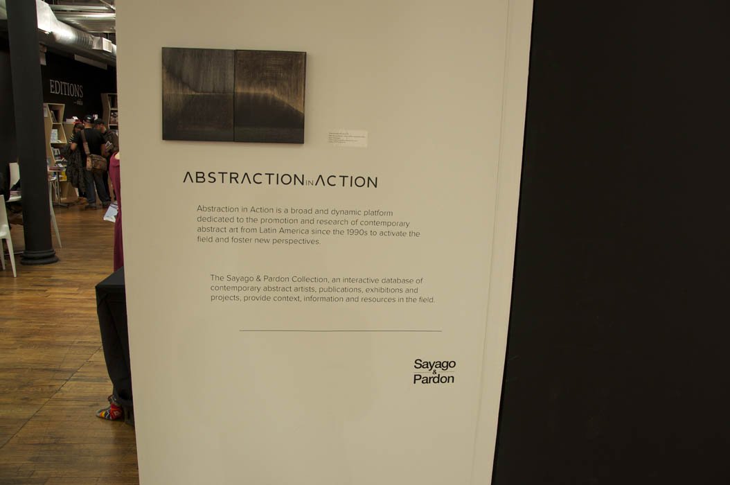
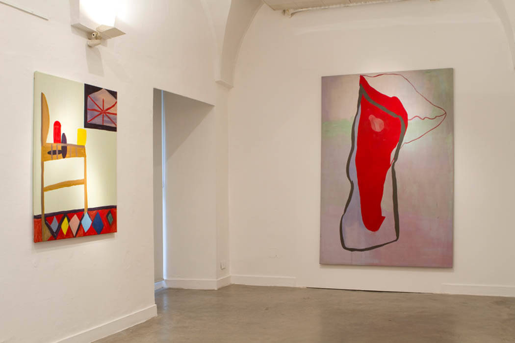
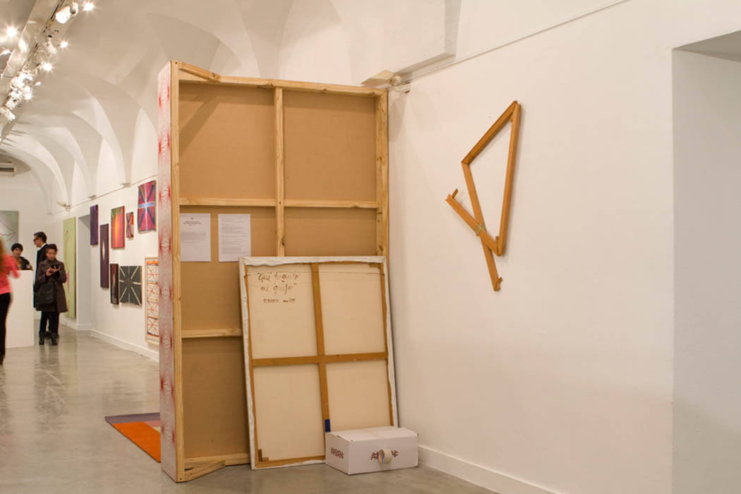
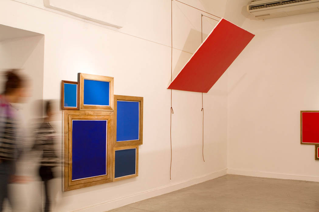
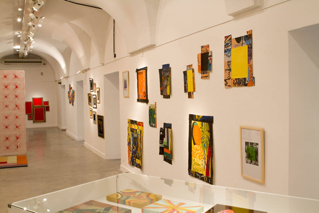
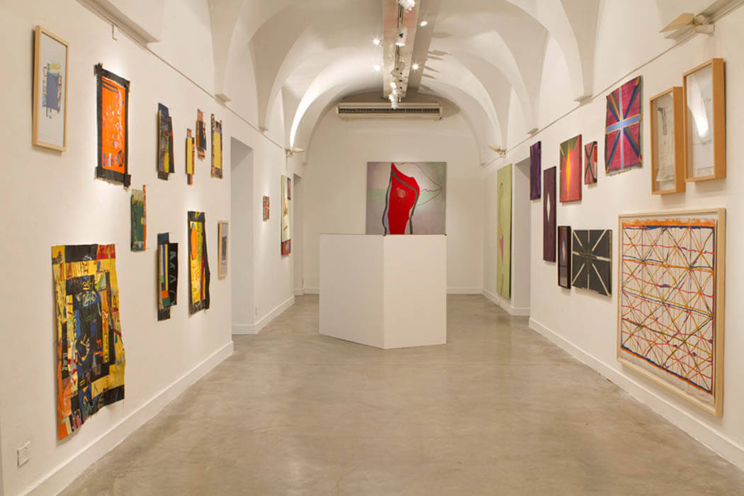
Everyday Reflections in Abstraction
SPACE Collection
Curated by Cecilia Fajardo-Hill and Greg Attaway
July 29th, 2016 – January 1, 2017
SPACE, Irvine, CA
Artists: Esvin Alarcón Lam, Jaime Ávila, Omar Barquet, Pia Camil, Casari & PPPP, Gabriel de la Mora, Marcius Galan, Guido Ignatti, Jorge Méndez Blake, Felipe Mujíca, Mario Navarro, Ricardo Rendón, Clarissa Tossin, Adán Vallecillo
We can find echoes of our daily experience in the world, ranging from the intimacy of our homes to the expansive arena of the outer world in Latin American contemporary abstraction. Everyday Reflections in Abstraction is divided into two sections: Interior and Exterior. Interior includes Esvin Alarcón Lam, Omar Barquet, Guido Ignatti, Jorge Méndez Blake, Gabriel de la Mora, Felipe Mujica, Mario Navarro and Ricardo Rendón, all dealing with the transformation of unpretentious elements of a domestic setting such as chairs, cots, mirrors, copper tubes, curtains, and a window. Exterior encompasses Jaime Ávila, Pia Camil, Alberto Casari, Marcius Galan, Clarissa Tossin, and Adán Vallecillo, focusing on the paradoxical structures that shape the urban environment and our interactions with it.
Everyday Reflections in Abstraction is an Abstraction in Action initiative to promote new ways of thinking and experiencing Latin American contemporary abstraction through art works from the holdings of the SPACE Collection. The show is curated by Cecilia Fajardo-Hill and Greg Attaway.
_
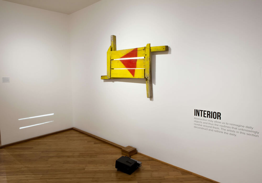
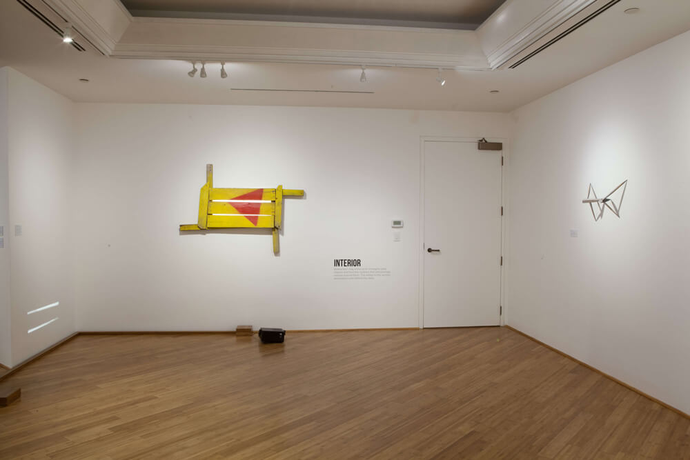
Interior
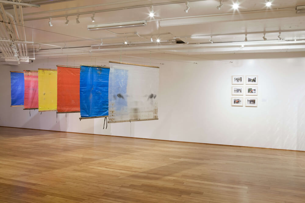
Abstraction may allow us to reimagine daily objects and thus the routines that unknowingly revolve around them. The artists in this section deconstruct and rethink the daily. Esvin Alarcón Lam Variation with Cots (Variation No.1), 2014 is a large installation made with old and rusty found cots, that rearticulate the very syntax of one of the most elemental icons of human existence: the cot, to become a sort of imaginary text or musical composition. Omar Barquet Astillas, 2012 displays small fragments of legs from chairs, thus displacing the chair from its use to a ghostly presence on the wall. This work is part of the artists ongoing research on the language of design combined with the daily, which implodes conventions to create open situations. By the artist Gabriel de la Mora is Pomona 36 II D, 2012, composed of a 1904 detached ceiling. According to the artist this is, “a painting done over the course of 108 years”, thus the traditional idea of decorative painting on the wall is replaced by a large ready-made of a ceiling. Felipe Mujica, Untitled (Curtain #3), 2013 is an example of installations Mujica has produced with fabric panels. According to the artist these “aim to be drawings that occupy space and also curtains that function as space organizers, as temporary walls that canalize the public’s circulation and perception of space as well as the perception of other possible art works in space. In this sense these installations are both an object of contemplation as well as a functional device, they become exhibition design and flexible temporary architecture.”
Guido Ignatti, Pintura y tapiado para una ventana inexistente, (Boarded Up Painting for an Inexistent Window), 2012 offers the illusion of a window and exterior light when none exists. The artist writes that “another place becomes possible if we open the windows.” For Ignatti, light during the day reveals the passing of time and how we are subjected to it. At night when the light is absent, artificial light, does the opposite. Perhaps this work offers just that, the illusion that neither separation between the outside and the inside exists, nor between day and night, or natural and artificial.
Mario Navarro The Original Accident (Section IV), 2015 is a large scale installation with mirrors which instead of reflecting the organic form of the spectator, it atomizes the wall in a geometric composition with multiple reflections of the mirrors themselves. This work is part of an ongoing investigation by the artist on the relationship between the principles of architecture and forms through sculpture and installation, with the aim of pushing the boundaries of composition, space and perception. Ricardo Rendón, Circuitos de Iluminaciíon (D’Alembert), 2015 and Circuitos de Iluminaciíon (Voltaire), 2015 are sculptures in copper and felt, associated with labors executed by plumbers and electricians. Rendón produces unexpected sculptural compositions which contrast the soft texture and bright color of the felt with copper tubes. A further reference in the piece are the names of d’Alembert and Voltaire, alluding to ‘Enlightenment’, thus bringing together the lighting as a practical element and the more philosophical allusion to knowledge. Espacio de concentración (fricción y contacto 8), 2010 by Ricardo Rendón materializes the beauty of basic materials of construction such as sand paper, copper pipes, industrial felt, and wood. What may seem excessively humble and common materials become the structural elements for sculptures that are highly pictorial with their large planes of yellow felt or colored sandpaper.
Jorge Méndez Blake, Monumento a James Joyce, 2011 bridges both the indoor and the outdoor sections of the exhibition. The artist relates classic literature with contemporary architecture and visual arts to create art based on the notion of the “library”. This work refers to Ulysses (1922) by James Joyce which recounts in 600 pages the events in Leopold Bloom during one day, therefore turning a day into something incalculably complex. “The Library/monument has a simple exterior form, a cube (the day), but inside is a complex and infinite number of shapes and reflections. The possibility of infinity in a day.” This work by Mendez-Blake symbolizes how the daily may be expanded immeasurably through art.
Exterior
This section highlights artists’ unconventional relationship with the urban environment and their capacity to transform and highlight both the visible and the invisible, the common and the extraordinary. Jaime Ávila’s installation Untitled from the series Talento Pirata, 2013, speaks of how piracy in the form of illegal copying of movies and music through technology has become a widespread type of informal economy, especially for unemployed people that sell them in the streets. The artist, in the same way that a movie can be reproduced hundreds of times, has created 546 CD boxes which replicate this form of illegal economy and urban landscape, by combining photographs and cut outs of colorful geometric shopping bags. Pia Camil Espectacular Telón, 2013, is a large backdrop curtain with images appropriated or copied directly from billboards that have been transformed due to abandonment and the passing of time, speaking this way of the failures of mass culture. For the artist this work being a curtain -a domestic element- it creates a relationship with the culture of spectacle. Alberto Casari, EM.SB.13.2, 2013 is a work made with a waxed canvas with holes. The canvas was once a truck tarpaulin that the artist cut, intervened horizontally with dark paint on the lower section and hung from a strip of wood, paradoxically invoking a sort of meditative landscape, grounded on the materiality of the work. Marcius Galan Irregular Division, 2014, is a concrete geometric floor installation which configuration may bring to mind sidewalks while creating a division of the gallery space. Thus, in the artist’s words “exploring the metaphorical capacities of space and our relation to it (… and) interrogating the functions, limits and frontiers of space and by extension, the socio-political systems which reside therein”. Clarissa Tossin Brasília by Foot, 2009-2013 presents the footpaths made by pedestrians within the Monumental Axis, a modernist urban structure in the city of Brasília, consisting of six lane roads with no traffic lights or sidewalks. The complex networks of organic geometric paths created by pedestrians, contrasts with the modern urban structure that excluded them in the first place. Adán Vallecillo’s Pantones, 2013 displays a series of brightly colored sheets of plastic in space, that when seen in close proximity we observe dirt and wear of the material. For this work the artist reflects on the resourcefulness of the people in the jungle town of Iquitos, Peru, in deploying the sheet of cheap colorful plastic to protect their motorcycle taxis, thus creating a popular and unselfconscious form of live abstraction.
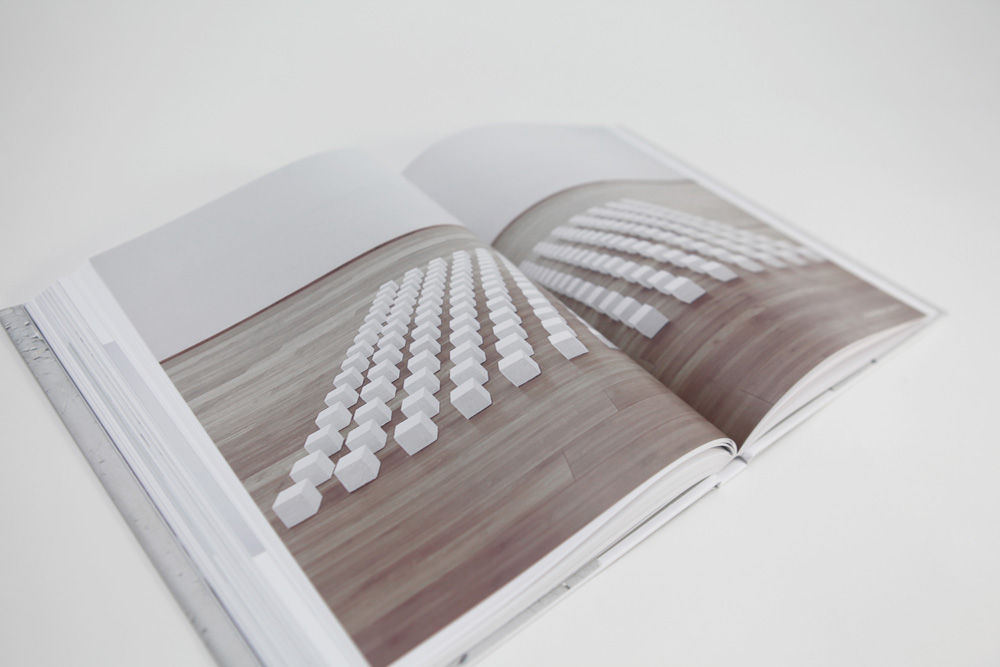
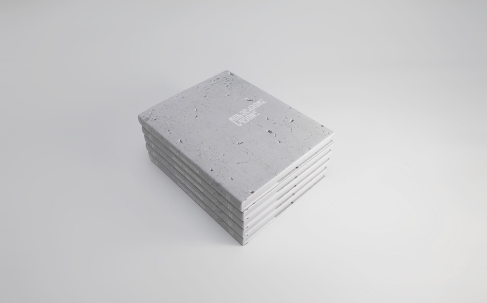
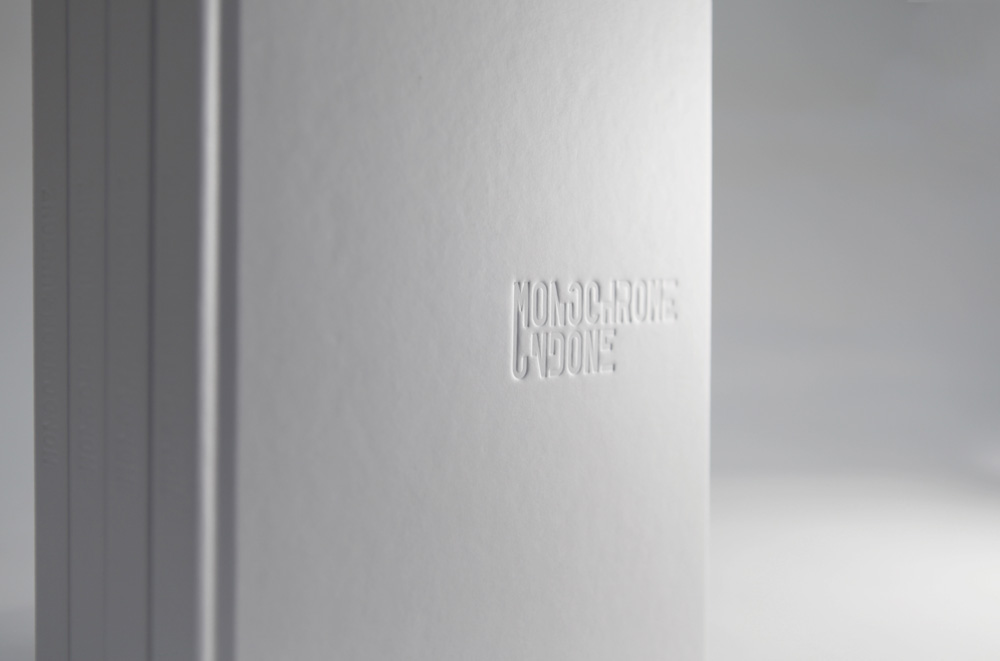
July 25, 2016 Monochrome Undone https://abstractioninaction.com/projects/monochrome-undone/
Monochrome Undone
SPACE Collection
Curated by Cecilia Fajardo-Hill
October 24, 2015 – April 1, 2016
SPACE, Irvine, CA
Artists: Ricardo Alcaide, Alejandra Barreda, Andrés Bedoya*, Emilio Chapela, Eduardo Costa, Danilo Dueñas, Magdalena Fernández, Valentina Liernur, Marco Maggi, Manuel Mérida, Gabriel de la Mora, Miguel Angel Ríos, Lester Rodríguez, Eduardo Santiere, Emilia Azcárate, Marta Chilindrón, Bruno Dubner, Rubén Ortíz-Torres, Fidel Sclavo, Renata Tassinari, Georgina Bringas, Abraham Cruzvillegas, Thomas Glassford, José Luis Landet, Jorge de León, Bernardo Ortiz, Martin Pelenur, Teresa Pereda, Pablo Rasgado, Ricardo Rendón, Santiago Reyes Villaveces, Mariela Scafati, Gabriel Sierra, Jaime Tarazona, Adán Vallecillo, Horacio Zabala.
The monochrome as a focus in the SPACE Collection began in a spontaneous form and soon became a systematic field of research. This exhibition is about the contemporary monochrome in Latin America. The monochrome is one of the most elusive and complex art forms of modern and contemporary art. If we think about its origins or meaning, we find that the monochrome is many contradictory things. The monochrome is neither a movement nor a category; it is not an “ism” or a thing. It may be painting as object, the material surface of the work itself, the denial of perspective or narrative, or anything representational. The monochrome may be a readymade, a found object, or an environment—anything in which a single color dominates. The monochrome can be critical and unstable, especially when it dialogues critically or in tension with modernism. This exhibition is organized into four different themes: The Everyday Monochrome, The White Monochrome, The Elusive Monochrome and The Transparent Monochrome. These themes have been conceived to create context and suggest interpretations that otherwise might be illegible. These may overlap at times, pointing to the multiplicity of content in many of the works. The unclassifiable and variable nature of the monochrome in Latin America today is borne of self-criticality and from unique Latin contexts, to exist within its own specificity and conceptual urgency.
To purchase the catalogue click here.
—
El monocromo, como enfoque de SPACE Collection, comenzó de forma espontánea y a poco se convirtió en un campo de investigación sistemático. Esta exposición trata sobre el monocromo contemporáneo en América latina. El monocromo es una de las formas de arte más elusivas y complejas del arte moderno y contemporáneo. Si reflexionamos acerca de sus orígenes o su significado, nos encontramos con que puede albergar muchas cosas contradictorias. El monocromo no es un movimiento ni una categoría; no es un “ismo” ni una cosa. Puede ser la pintura como objeto, la superficie material de la obra, la negación de la perspectiva o de todo lo representativo o narrativo. El monocromo puede ser un readymade, un objeto encontrado, un cuadro o un ambiente: cualquier cosa definida como una superficie cromáticamente uniforme donde un solo color predomina. El monocromo puede ser crítico e inestable, especialmente cuando se dialoga críticamente o en tensión con el modernismo. Esta exposición está organizada en cuatro temas: el monocromo cotidiano, el monocromo blanco, el monocromo elusivo y el monocromo transparente. Estos temas han sido concebidos a fin de crear un contexto y sugerir interpretaciones que de otra manera podrían ser ilegibles. Éstos pueden superponerse a veces, apuntando a la multiplicidad de contenidos en muchas de las obras. La naturaleza indeterminada, inclasificable y variable del monocromo en Latinoamérica hoy en día es producto de la autocrítica y de los contextos propios, para existir dentro de su propia especificidad y urgencia conceptual.
Para comprae el libro haz clic aquí.

-
- Monochrome Undone exhibition, curated by Cecilia Fajardo-Hill, SPACE, CA, USA.

-
- Monochrome Undone exhibition, curated by Cecilia Fajardo-Hill, SPACE, CA, USA.
-
- Monochrome Undone exhibition, curated by Cecilia Fajardo-Hill, SPACE, CA, USA.

-
- Monochrome Undone exhibition, curated by Cecilia Fajardo-Hill, SPACE, CA, USA.

-
- Monochrome Undone exhibition, curated by Cecilia Fajardo-Hill, SPACE, CA, USA.
-
- Monochrome Undone exhibition, curated by Cecilia Fajardo-Hill, SPACE, CA, USA.

-
- Monochrome Undone exhibition, curated by Cecilia Fajardo-Hill, SPACE, CA, USA.

-
- Monochrome Undone exhibition, curated by Cecilia Fajardo-Hill, SPACE, CA, USA.
-
- Monochrome Undone exhibition catalogue.
-
- Monochrome Undone exhibition catalogue.

-
- Monochrome Undone exhibition catalogue.
-
- Monochrome Undone exhibition catalogue.
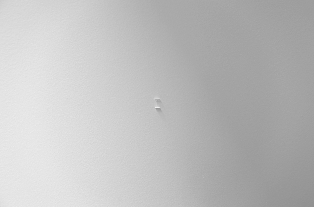
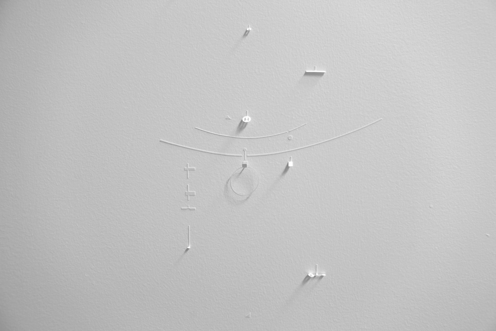
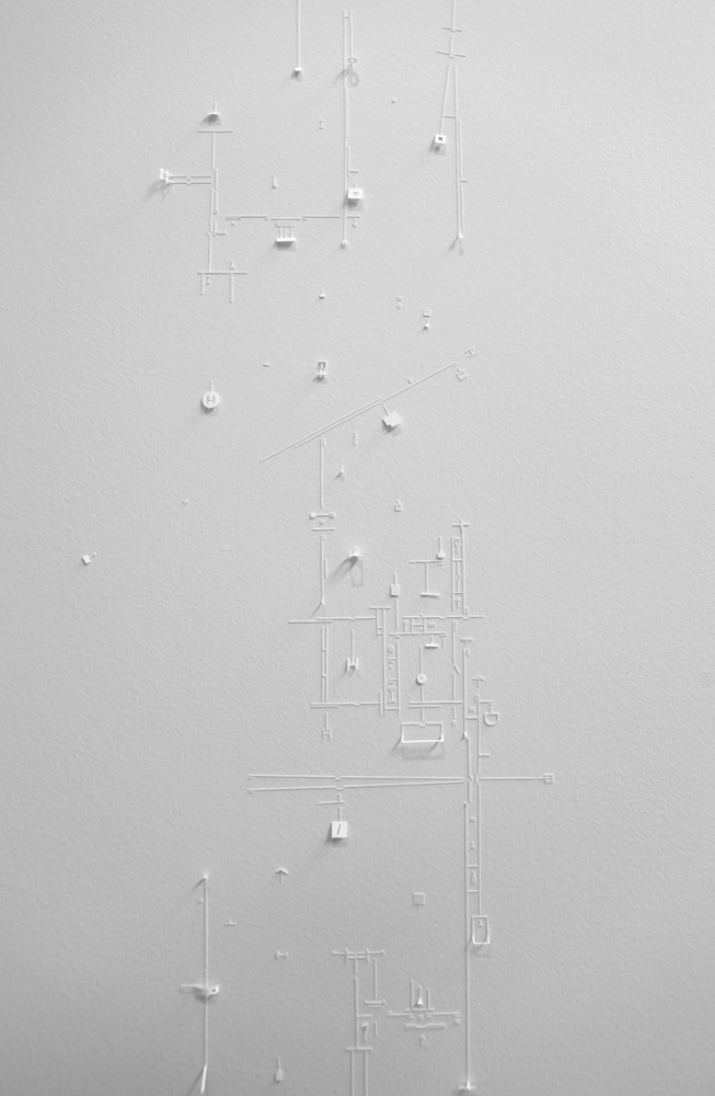
Marco Maggi
Into Whiter Space
June 13, 2015 – April 1, 2016
SPACE, Irvine, CA
The Sayago & Pardon Collection is proud to present Into Whiter Space, a project of Abstraction in Action. Marco Maggi’s Into Whiter Space, 2015 is a site-specific installation at SPACE, Sayago & Pardon’s headquarters located in Irvine, California. Into Whiter Space was produced in the context of the exhibition Monochrome Undone, opening at SPACE October 24, 2015.
Into Whiter Space alludes to the purist and conclusive modern idea of a uniform white painterly surface of the monochrome. The piece is proposed as a sort of textured and irregular, but delicate, skin on two large facing walls. These walls are intervened with hundreds of small white stickers cut in different shapes. The artist comments: “…around them [are] more and more stickers, like growing towns to build a big city [L.A.?] or adding letters, sentences, paragraphs, chapters to write a novel. Homeopathic process, constructing or demolishing syntax.”
The artist aims not only for us to slow down, but to lose our daily sense of purpose while observing the work. Our eyes make sense of the world through the interaction of the focal and the peripheral visions. Whereas the focal allows us to focus on details and represents our conscious vision, the peripheral helps us to organize space and encompass shadow to create context. Through one pragmatic act of seeing, Marco Maggi’s Into Whiter Space can neither be apprehended in its totality, nor its many details. The complex, structured, yet unpredictable surface challenges a deliberate single-minded gaze for us to discover a freer, slower, and broader way of seeing. Maggi’s monochrome does not function as a blank purified space of order and control; instead it is paradoxically unsubordinated and it denaturalizes the conceptual neutrality associated to white. Time slows down and totality is not possible. Into Whiter Space will have a second life, as a digital platform on Abstraction in Action. The Internet will provide an intimate experience allowing the particularities of every cutout to be explored in detail while the whole still remains elusive.
—
Into Whiter Space alude a la idea purista, moderna y concluyente de la superficie pictórica blanca y uniforme del monocromo. La pieza se propone como una especie de piel texturizada, irregular, sobre dos grandes muros contiguos. Estas paredes se intervinieron con cientos de pequeñas calcomanías blancas cortadas en diferentes formas. El artista comenta: “…alrededor de ellos [son] más y más calcomanías, como ciudades en crecimiento construyendo una gran ciudad [¿Los Ángeles?] o agregando letras, oraciones, párrafos, capítulos para escribir una novela. Proceso homeopático, construyendo o destruyendo sintaxis.”
El artista tiene como objetivo no sólo que nos detengamos, sino que perdamos nuestro sentido del propósito diario al observar su obra. Nuestros ojos hacen sentido del mundo a través de la interacción entre las visiones periféricas y focales. Mientras que la visión focal nos permite centrarnos en detalles ya que representa nuestra visión consciente, la visión periférica nos ayuda a organizar el espacio y abarca sombra para crear contexto. A través del acto pragmático de ver, Into Whiter Space no puede ser aprehendida en su totalidad ni en sus muchos detalles. La superficie compleja, estructurada y, aún así, impredecible, desafía la mirada inquebrantable con el propósito de descubrir de una manera más libre, más lenta y más amplia del acto de ver. El monocromo de Maggi no funciona como un espacio blanco, puro, en orden y control, por el contrario, es paradójicamente insubordinado y desnaturaliza la neutralidad conceptual asociada a lo blanco. El tiempo se torna lento y la totalidad deja de ser posible. Into Whiter Space tendrá una segunda vida en la plataforma digital de Abstraction in Action. El Internet proporcionará una experiencia íntima permitiendo que las particularidades de cada recorte se exploren en detalle, mientras que el conjunto seguirá siendo elusivo.
—
Interview with Marco Maggi
Cecilia Fajardo-Hill: Where and how did the idea to construct surfaces with sticky white tags originate?
Marco Maggi: Letterpress: transferable letters very common before computation revolutionized graphic design. I never thought of tags or stickers: I began with the image of self-adhesive alphabets. The objective was to have a medium capable of editing a wall by disseminating thousands of independent and unintelligible particles.
I looked for a ceramic paper free of acid and I found an archival form of making it self-adhesive. I began increasing control over the sticking and folding of little papers until I was able to reduce the scale of my cuts to a visual whisper or insignificant text.
The resulting landscape appears like an incubator of language, or the complete opposite… segments of castaways from the dictionary.
The message lost it’s meaning toward the end of the seventies and in reality 95% of the present description of the universe is made through mathematical metaphors. The words loose footing in the contemporary discourse and uncertainty has no one who will write of it. Drawing is the only way to think without letters or numbers… indeed this is what the particles on the translucent boards of Letterpress were.
CF-H: How does this new facet of your work relate and diverge from your previous work, like the intervened slides or the aluminum foil?
MM: I work with surface tensions in different materials seeking to approach and stop the observer. An invitation for a change of protocol: reduce distance and velocity, two largely present illnesses. In synthesis, the promotion of pauses and approaches connects all of my works. The surface and calligraphy that each one generates may change, but all of my drawings seek to make time visible and to establish an objective intimacy.
CF-H: It would appear that the tags give you the possibility of expanding your work in space, something that I have not seen before in your work, that only amplified itself into larger formats through the multiplication of slides. What new possibilities does it offer you to work spatially? Is working in space something that you were pursuing or did it happen in a ‘natural’ way?
MM: Each show is and was a great drawing that edits the space with seasons or elements. Before they were stacked paper on the floor, frames, panels, slide stacks, shelves on the wall, etc. I always face each room like an itinerary: a great folded sheet on the walls-ceiling-floor where the works complete the function of paragraphs of text.
Now with thousands of self-adhesive elements, the dialog with the space has been made more intense and notable because it permits the inclusion of the observer in the page.
CF-H: The Uruguay Pavilion at the Venice Biennial is the most ambitious and laborious work that you have realized to this date. What experience does working at this scale offer you?
MM: I began training in the preceding months. I knew that the sum of the walls was equivalent to a sheet 40 meters long and 4 meters tall and the plan was to traverse it over months from the verticality of the ladder to the horizontality of the base.
After occupying myself with the health of each inch of the Pavilion, the most surprising result was the profound relationship with the building. When Uruguay bought it in 1960 it was the tool storage room for the gardens of the Biennial; today it is a humble and surprising testament to the squandering of resources that surrounds these events.
CF-H: How do you conceive of these surfaces covered with tags in different formats: wall, paper, large or small? How does their nature change by being constrained by a frame or by being atomized on a wall?
MM: It is like comparing a novel with a short story. The objective, vocabulary and syntax remain the same, but the structure of the tale needs to respond to its scale. In the wall installation, first that which is tree-like, the fragility and the expiration date.
The frames have to function like windows onto a second reality and not like cages to preserve a Bonsai wall.
The essentials in a framed drawing are the escape attempts, the lines of flight. A frame should be faced like a portable infinity.
To read the walls of a room allows the observer to walk, to select their itinerary and their rhythm.
A framed drawing allows exactly the same for the gaze. The rules of transit are similar and the discretion is identical: when entering the room appears empty, when looking at a framed drawing from a distance the information is erased.
In a room time depends on space, in a frame the space depends on time…two different relationships that generate complementary experiences.
If one examines a sheet of paper with great attention one discovers more space and diversity than flying quickly over the Sahara desert. The space always depends on some information that stimulates one to slow down and the capacity of the observer to stop and excavate the visual field.
CF-H: What role does light play in these white surfaces? In Venice the light that you installed was very white and clean, while in SPACE, the light is much more complex and changing, due to the intervention of exterior light that changes during the day, the light of the work areas, and the light of the installation itself. What happens with your work in these very different circumstances?
MM: The illumination in Venice is perfect for my work. An even field of light that generates shadows and high definition projections. It is a technology that had been never seen before 2014, which combines the softness of a wall washer with the hardness of a halogen reflector. The key is that they are light projectors and not reflectors. For that reason the walls of the Pavilion appear to illuminate instead of being illuminated.
In SPACE all of the work is playing off of the permeability of the context. Everything happens between a large office and a garden that incorporates the light of the sun or the shadows of a single tree. The extremely vertical light bulbs create a rain of light in a region where it barely rains.
CF-H: One of the aims of your work is to reduce the speed of our daily lives and create an interruption that promotes observation without purpose. How do you achieve this with a work that is invisible at first?
MM: In front of that which is spectacular and rotund, one step backward, creating distance. The spectacular is short, intense, distant and repetitive in the reactions it provokes.
That which does not seek to impact, does not exist until it is discovered and it is capable of creating empathy, attention, dialog and diversity in responses. The discrete embodies.
The opposite of a shock is a blank pause… it is like buying an overdose of information with a coat rack. When reality made itself illegible, visual arts preferred to become invisible.
CF-H: Your installation in Venice is called Global Myopia and the installation in SPACE is called Into Whiter Space. Both titles allude to an un-drawing of the concrete and the visible on a global scale or in the space. And yet, these works allude to an act of seeing, to loose oneself in the detail, to find intimacy in an abstract space. Can you speak about this conceptual aspect of myopia and white space?
MM: I like precise confusions and slow scandals. One reads “Global Myopia” and thinks of a near-sighted world that walks toward its grave.
However, the title Global Myopia is a prescription and not an accusation. It is an elegy to the myopia that suggests that we globally adopt a protocol or gesturality of the near-sighted. All near-sighted people see better than anyone by stopping and getting close to what one observes.
After a farsighted twentieth century, capable of engendering “solutions” for everyone and forever, we deserve a XXI century less pretentious and focused on those who are in our proximity and that which is in our proximity (proximity of closeness).
After so many definite certainties we should partake in a sensible digression, doubtful and precarious.
The white? There is nothing more uncertain than white over white. Without any contrast it has an infinite amount of information that is rendered imperceptible with out the attention and participation of the other. The information stuck to the wall, on the threshold between 2 and 3 dimensions, does not interfere with the landscape; it flattens like illiterate ivy.
CF-H: We have spoken about the role that focal and peripheral sight plays in the act of looking at your work, since your work does not allow us to see everything, just details, and at the same time it exists and has sense in only in totality. Could we think of your work as a totality in fragmentation, like a sort of archeology of a totality? How do you imagine and propose the act of seeing in an installation like Into Whiter Space?
MM: The ideal would be not to go specifically to see it but to cross this landscape naturally until one finally detects a vibration in the surface of the wall… a faint shadow of the point of a thread. And from the first little paper that one finds one traverses the network of particles, creating a unique itinerary.
With Into Whiter Space, one cannot read its two chapters at the same time; they are two walls or pages in confrontation (hemistich). Only with much attention can one discover one and another wall in alternating form that the structures are almost identical like a reflection in paper.
The work includes various strategies to retain the observer such as scale and dispersion, with the illusion of multiplying empathy for the insignificant.
When someone has something very clear to communicate, one orders, synthesizes and designs one’s message. One imposes an angle of reading on the receiver and one distributes it as quickly as possible. These parameters of communication are ones shared by news agencies, advertising and conceptual art. Brilliant ideas, magic products or brave accusations, and edited to urgently infect the other.
In my case, the exact opposite happens… since I don’t have anything to say, my process is slow because there is no rush to communicate the result. Its reading is entirely free, delayed, partial and barely possible.
It deals with installing an inclusive and infinitesimal landscape based on an elusive dissemination.
I have no ideas and the ones I include in this response have an expiration date. When I read them again I will consider them junk from a drawing or ideology of the draughtsman.
I have never regretted what I have drawn… I don’t use an eraser. I always regret what I say. I am a radical optimist and for this reason I continue to answer.
CF-H: White is linked with the ideal color of modernism with its ordered and utopian associations. What is the place that the color white occupies in your work and in this installation in particular?
MM: White on white is the most radical camouflage; it is the manifest intention of erasing itself. There is nothing less graphic and emphasized than a polar bear. Erasing me, visual arts on the threshold of blindness.
CF-H: What does working in a space like SPACE mean, where the activity that is occurring concerns the digital world where the language, the sounds, and the energy of the place and its people have nothing to do with the art world? Did you encounter some relationship between your complex surfaces and the complexity of the digital world and data?
MM: I arrived in Irvine with a kit of thousands of little papers and I had the general structure of the drawing: stereophonic dialog between Left and Right walls.
What I did not foresee was that SPACE integrated abstraction through mathematics, art and Big Data. A building dedicated to the relationship between the micro and the macro in disciplines with such different objectives and reading processes so similar. The light, the personal climate and the horizontality of SPACE are the opposite of an impeding hierarchical pyramid. A climate of a university campus without the least need for anyone to feel like a professor. A world that has recently emerged resulting from a cultural revolution never seen before.
CF-H: What could be the analog between “Big Data” and the utopian surfaces of stickers that you created with Into Whiter Space?
MM: That relationship is intimate, surprising and in no ways utopian: macro, micro, margin.
When you order the routines attitudes, and comportments of hundreds of millions of people (Big Data) the result is not a unified and obvious chorus, but instead a cacophony that hides thousands of possible melodies or discourses.
Every specialist, confronting this mute wall, hears it by establishing connections that have never been made with the data that will permit one to define tendencies and detect predictions drowned in an ocean of information. Like a reader of a macro sky capable of isolating the micro relationship between the three Marías or the obvious orientation of the Southern Cross.
Big Data unifies homeopathic doses of information. Distant, dispersed, disseminated and discrete signs like thousands of white micro papers on a white wall.
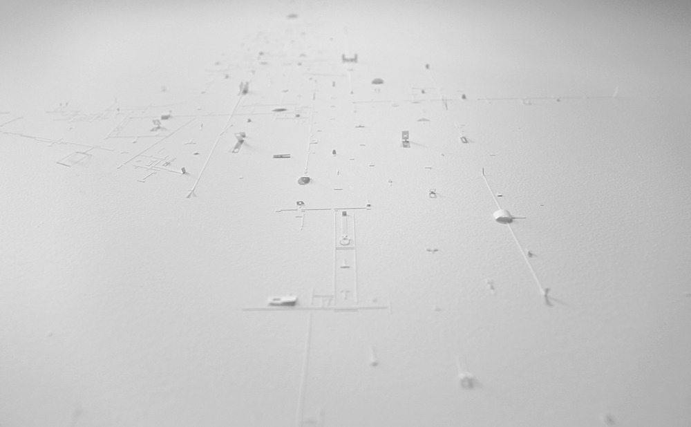
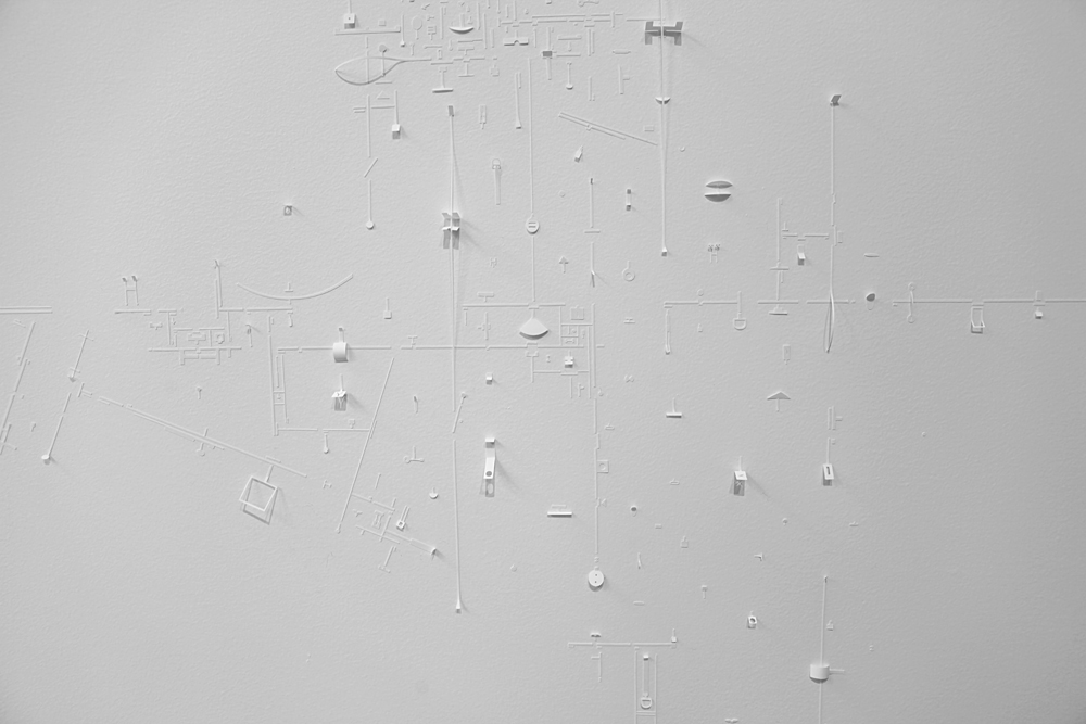
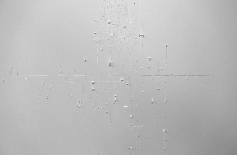
-
- Marco Maggi, “Into Whiter Space” (detail), SPACE, 2015.

-
- Marco Maggi, “Into Whiter Space” (detail), SPACE, 2015.
-
- Marco Maggi, “Into Whiter Space” (detail), SPACE, 2015.
-
- Marco Maggi, “Into Whiter Space” (detail), SPACE, 2015.
-
- Marco Maggi, “Into Whiter Space” (detail), SPACE, 2015.
-
- Marco Maggi, “Into Whiter Space” (detail), SPACE, 2015.
-
- Marco Maggi, “Into Whiter Space” (detail), SPACE, 2015.

-
- Marco Maggi, “Into Whiter Space” (detail), SPACE, 2015.
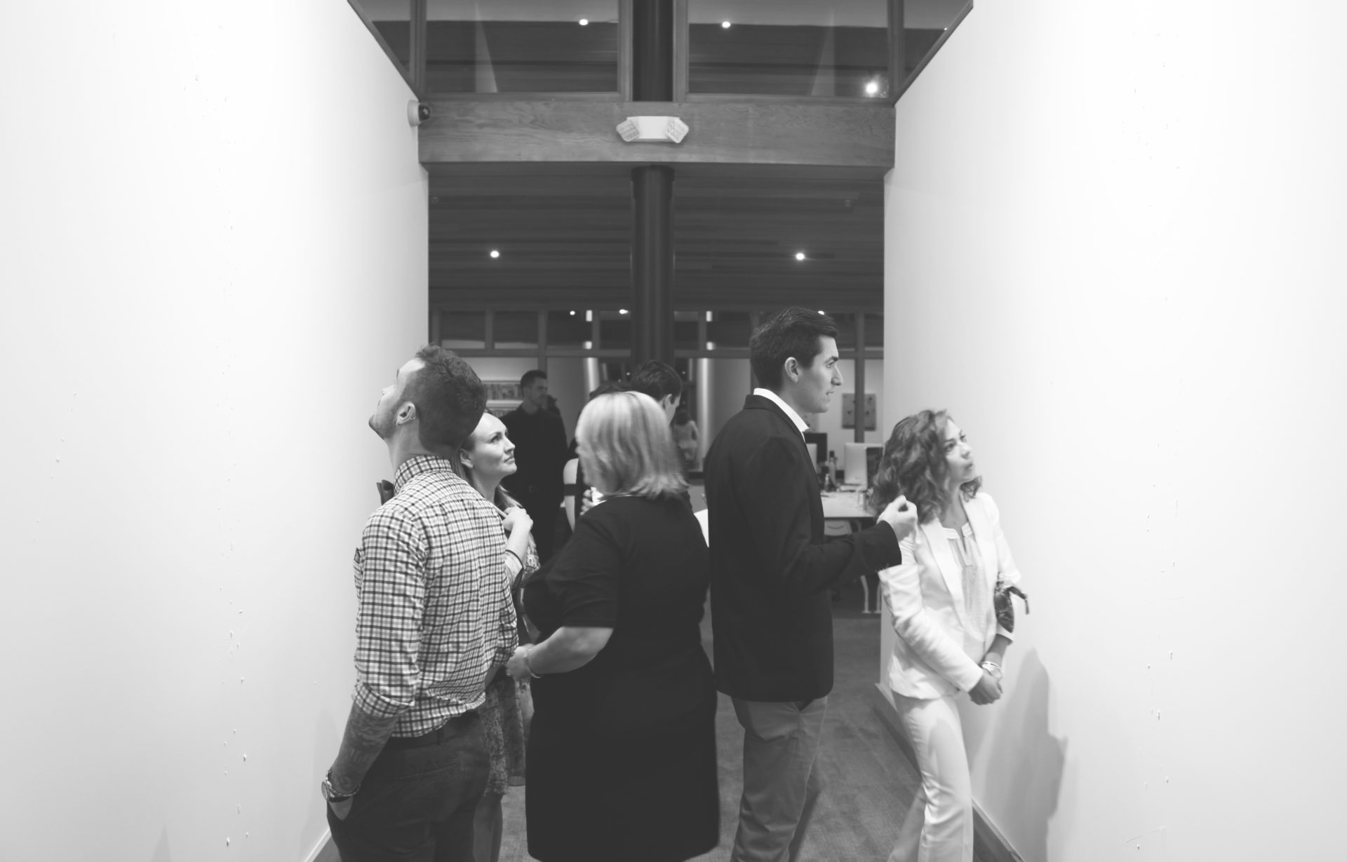
-
- Exhibition view during opening reception of “Into Whiter Space”, 2015
-
- Exhibition view during opening reception of “Into Whiter Space”, 2015

-
- Exhibition view during opening reception of “Into Whiter Space”, 2015

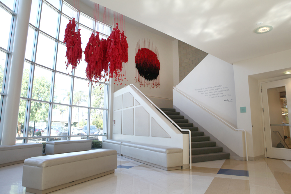
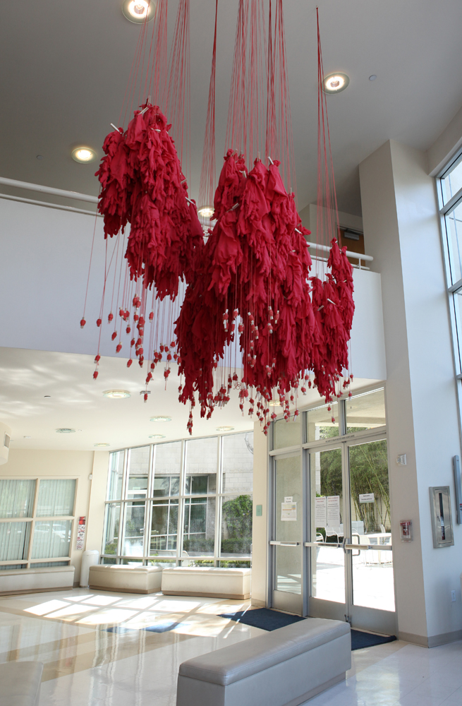
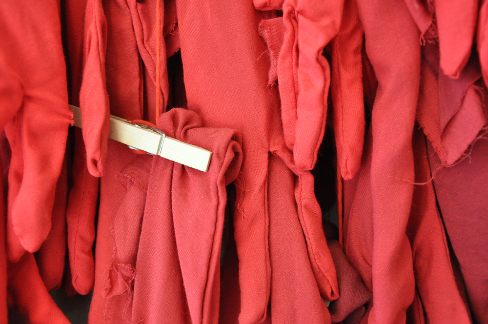
Ana Belén Cantoni
The Soft Gesture
The Wooden Floor
Santa Ana, California
The Soft Gesture, a commission by the Sayago & Pardon collection, is the title of a large-scale installation by Colombian artist Ana Belén Cantoni, created specifically for The Wooden Floor, Santa Ana, CA. Inspired by the students’ testimonies of how art and dance empower their everyday lives, Cantoni evokes the human body and its potential for individual growth within communal coexistence by the usage of simple materials that remind the cycles and processes of transformation through movement (cloth and wooden clothespins, as well as ink and graphite on cotton). The Soft Gesture is a vision towards the awakening of primal associations and the creation through physical connections.
Download the catalogue here.
—
El gesto suave, una comisión de arte de la colección Sayago & Pardon, es el título de la instalación a gran escala de la artista colombiana Ana Belén Cantoni, creada específicamente para The Wooden Floor, una organización sin fines de lucro que capacita a jóvenes de bajos ingresos a través del baile y programas académicos y familiares en Santa Ana, California. Inspirada por los testimonios de los estudiantes sobre cómo el arte y la danza estimulan sus vidas diarias, Cantoni evoca el cuerpo humano y el potencial de crecimiento individual dentro de un entorno comunitario a través de la utilización de materiales comunes (tela y pinzas de madera, así como tinta y grafito sobre papel de algodón) que nos recuerdan los ciclos y procesos de transformación a través del movimiento. El gesto suave sugiere asociaciones primarias por medio del color (rojo y negro) al tiempo de invocar las fuerzas creativas de conexión física y social.
Descarga el catálogo aquí.
-
- Ana Belén Cantoni, “The Soft Gesture” installation view with students, The Wooden Floor, Santa Ana, California, USA

-
- Ana Belén Cantoni, “The Soft Gesture” installation view, The Wooden Floor, Santa Ana, California, USA
-
- Ana Belén Cantoni, “The Soft Gesture” installation view, The Wooden Floor, Santa Ana, California, USA
-
- Ana Belén Cantoni, “The Soft Gesture” installation view, The Wooden Floor, Santa Ana, California, USA

-
- Ana Belén Cantoni, “The Soft Gesture” installation view, The Wooden Floor, Santa Ana, California, USA
-
- Ana Belén Cantoni, “The Soft Gesture” installation view, The Wooden Floor, Santa Ana, California, USA

-
- Ana Belén Cantoni, “The Soft Gesture” installation view, The Wooden Floor, Santa Ana, California, USA

-
- Ana Belén Cantoni, “The Soft Gesture” installation view, The Wooden Floor, Santa Ana, California, USA

-
- Ana Belén Cantoni, “The Soft Gesture” installation view, The Wooden Floor, Santa Ana, California, USA

-
- Ana Belén Cantoni, “The Soft Gesture” installation view, The Wooden Floor, Santa Ana, California, USA

-
- Ana Belén Cantoni, “The Soft Gesture” (detail of drawing) The Wooden Floor, Santa Ana, California, USA

-
- Ana Belén Cantoni, “The Soft Gesture”, Drawing, The Wooden Floor, Santa Ana, California, USA

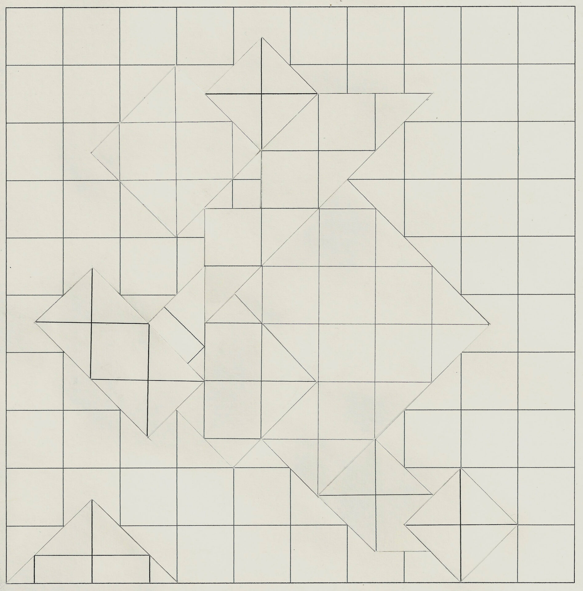
Marcolina Dipierro
Interrupted Line
Harris Center for the Arts
Bank of America Art Gallery
Folsom Lake College
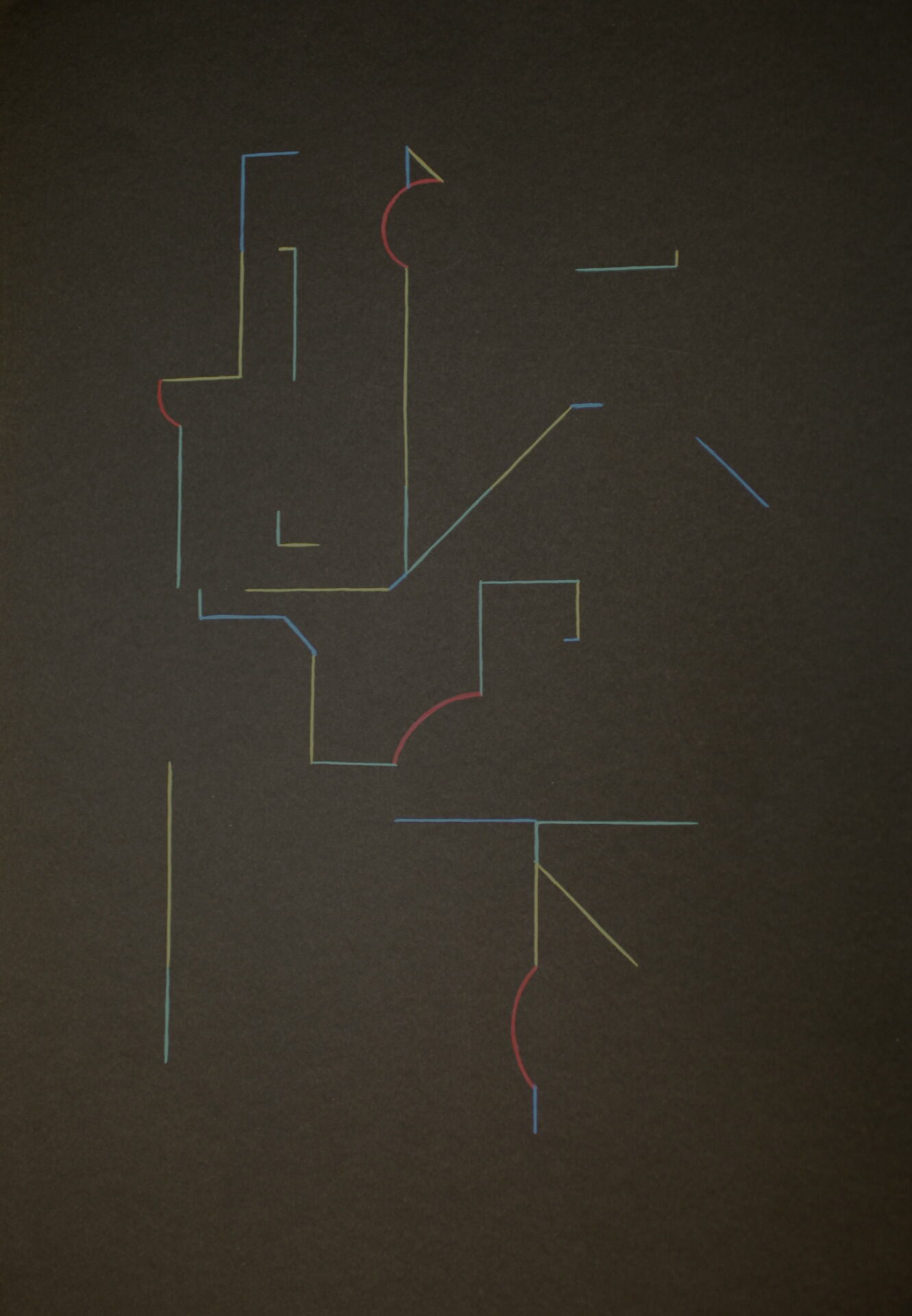
The space as a constructive tool — the line as a guide to navigate it. Interrupted Line is the first solo show by Argentinean artist Marcolina Dipierro (1978) on the West Coast. With works from the Sayago & Pardon Collection, Interrupted Line addresses the multiple ways in which space can be modified, altered, or interrupted with just a line, in a playful mode that resembles how life can be transformed or disturbed by everyday experiences. Dipierro works with a series of “objectual pieces” that consists of basic geometric elements: volumes, planes and lines made with simple materials. The use of linear forms made with acrylic, wood and paper collages is a constant in her works displayed at the gallery space.
Download the catalogue here
—
El espacio como una herramienta constructiva — la línea como una guía para navegar por él. Línea Interrumpida es la primera exposición de la artista argentina Marcolina Dipierro (1978) en la Costa Oeste de Estados Unidos. Con obras de la colección de arte Sayago & Pardon, Línea Interrumpida aborda las múltiples formas en las que el espacio puede ser modificado, alterado o interrumpido con apenas una línea, en un modo lúdico que asemeja cómo la vida puede ser transformada o interrumpida por las experiencias cotidianas. Dipierro trabaja con una serie de “piezas objetuales” que consisten en elementos básicos geométricos: volúmenes, planos y líneas hechas con materiales sencillos. El uso de formas lineales realizadas con acrílico, madera y collages en papel es una constante en sus obras expuestas en el espacio de la galería.
Descarga el catálogo aquí
-
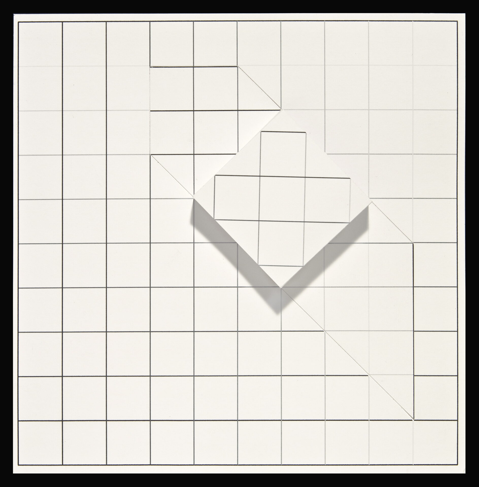
- Marcolina Dipierro, “Sin título”, 2013, Printed paper collage, 11 3/8 x 8 3/16 in. (28.9 x 20.8 cm). Sayago & Pardon Collection

-
- Marcolina Dipierro, “Sin título”, 2013, Printed paper collage, 11 3/8 x 8 3/16 in. (28.9 x 20.8 cm). Sayago & Pardon Collection

-
- Marcolina Dipierro, “Sin título”, 2012, Cedar wood and acrylic, 1 3/16 x 22 15/16 x 7 7/8 in. (3 x 58.3 x 20 cm). Sayago & Pardon Collection

-
- Marcolina Dipierro, “Sin título”, 2011, Logarithmic paper collage, 13 x 10 3/8 in. (33 x 26.3 cm). Sayago & Pardon Collection

-
- Marcolina Dipierro, “Sin título”, 2011, Logarithmic paper collage, 15 1/4 x 14 1/2 in. (38.7 x 36.8 cm). Sayago & Pardon Collection

-
- Marcolina Dipierro, “Sin título”, 2012, Printed paper collage, 8 1/8 x 7 15/16 in. (20.6 x 20.1 cm). Sayago & Pardon Collection
-
- Marcolina Dipierro, “Sin título”, 2012, Printed paper collage, 7 7/8 x 7 7/8 in. (20 x 20 cm). Sayago & Pardon Collection

-
- Marcolina Dipierro, “Sin título”, 2012, Printed paper collage, 8 1/4 x 8 1/16 in. (20.9 x 20.4 cm). Sayago & Pardon Collection

-
- Marcolina Dipierro, “Sin título”, 2012, Printed paper collage, 7 7/8 x 7 7/8 x 0 13/16 in. (20 x 20 x 2 cm). Sayago & Pardon Collection

-
- Marcolina Dipierro, “Sin título”, 2012, Printed paper collage, 7 7/8 x 7 7/8 x 0 9/16 in. (20 x 20 x 1.5 cm). Sayago & Pardon Collection
-
- Marcolina Dipierro, “Sin título”, 2009, Watercolor on paper, 20 9/16 x 29 1/2 in.(52.2 x 74.9 cm). Sayago & Pardon Collection

-
- Marcolina Dipierro, “Sin título”, 2010, Gouache on paper, 19 5/8 x 13 3/4 in. (49.8 x 34.9 cm). Sayago & Pardon Collection
Omar Barquet
Night Tide
Pinta, NY
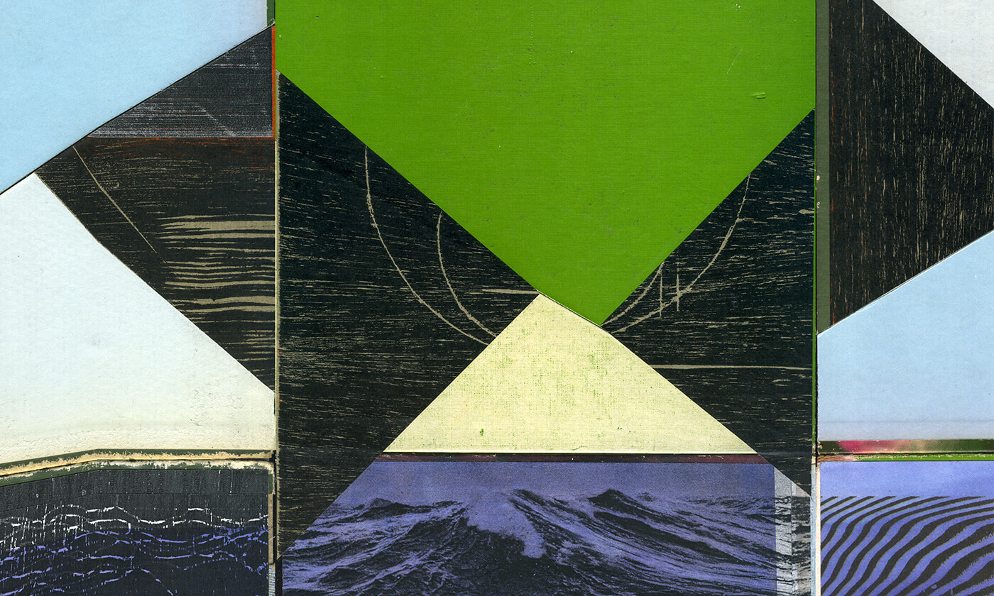
For the Abstraction in Action project commission at PINTA NY 2013, I proposed the creation of an ephemeral collage mural made with fragments of various failed tests of xylography, offset and photocopy prints, which were the result of several processes and treatments of digital and analog deterioration, providing a memory to these materials and emphasize the idea of interference. I find an interesting connection between the formal languages of Concretism and technical-scientific diagrams related to space, landscape, sound, time, and nature, as languages that take on abstraction, often with contradictory purposes, but from their intersections I saw the possibility of articulating different proposals with diverse mediums and focused on revising the dynamic landscape as a mental scene. Given the dimensions and duration of the commission, I considered that the project would function as an abstract composition which describes a sequence of changes in the pulsations of a night tide. The materials will be subjected to a process of graphic experimentation. The installation and de-installation of the stand will be extended as a circular process, generated from the fragmentation and rearticulation of three scientific encyclopedia’s back covers—their collage feel will be translated to the scale of the stand. — Omar Barquet
—
Para la comisión de un proyecto de Abstracción en Acción para Pinta NY 2013, propuse un collage mural efímero realizado con fragmentos de distintas pruebas fallidas de impresión en xilografía, offset y fotocopias resultantes de distintos procesos y tratamientos de desgaste, tanto digitales como analógicos, que otorgan una memoria sobre estos materiales y enfatizan la idea de interferencia.
Encuentro una interesante conexión entre los lenguajes formales del Concretismo y los esquemas técnicos de ciencia relativos a espacio, paisaje, sonido, tiempo y naturaleza, como lenguajes que asumen la abstracción con objetivos en muchas ocasiones contradictorios, pero que en cuyas intersecciones vi la posibilidad de articular distintas propuestas con medios igual- mente diversos y enfocadas a revisar el paisaje dinámico como escena mental.
Por las dimensiones y duración de la comisión, consideré que el proyecto funcionaría como una composición abstracta que des- cribe una secuencia de cambios en las pulsaciones de la marea nocturna. Los materiales serán sometidos a procesos de experimentación gráfica y todo el montaje y desmontaje del stand, será entendido como un proceso circular generado desde la fragmentación y rearticulación de tres contraportadas de una enciclopedia científica cuyo sentido de collage, será trasladado a la escala del stand. — Omar Barquet
-
- Omar Barquet, “Night Tide”, Pinta NYC, NY, 2013

-
- Omar Barquet, “Night Tide”, Pinta NYC, NY, 2013

-
- Omar Barquet, “Night Tide”, Pinta NYC, NY, 2013

-
- Installation view, “Night Tide”, Omar Barquet, Pinta NYC, NY, 2013

-
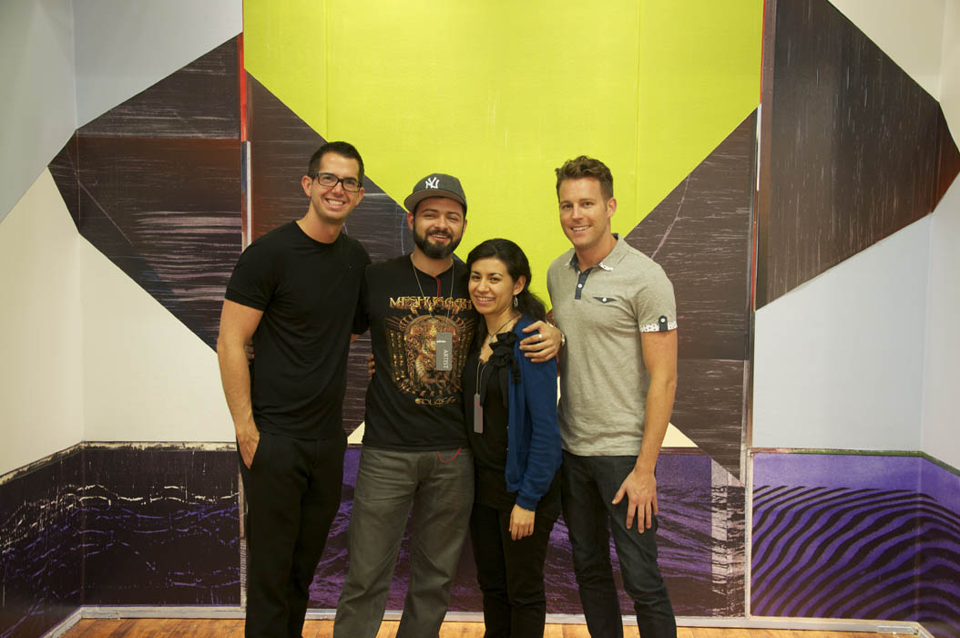
- Abstraction in Action team, “Night Tide”, Pinta NYC, NY, 2013
-
- Installation view, “Night Tide”, Omar Barquet, Pinta NYC, NY, 2013

-
- Installation view, “Night Tide”, Omar Barquet, Pinta NYC, NY, 2013
-
- Installation view, “Night Tide”, Omar Barquet, Pinta NYC, NY, 2013
Mariela Scafati
Paintings Where I Am (1998-2013)
Centro Cultural Recoleta, EGGO, Argentina
Mariela Scafati’s paintings comprise a record on personal experiences, displayed over a very wide diapason of artistic aspirations and abilities—the language of geometric abstraction, modern design and applied art, the activation of communication with the viewer and of spaces for artistic participation in the city, political propaganda and direct action, are some of the applications Scafati found for her painting in a time span encompassing her work in Buenos Aires since the late 90s, after having studied Fine Arts in Bahía Blanca. Painting, in these conditions, is not only the outlet for biography, but also a language contiguous with more experiences and practices: a language, in the end, which can be spoken in the street, at the gallery, in artists’ spaces like Belleza y Felicidad (where Scafati produced some of her main exhibitions) in political demonstrations, or in a home radio station. To find Scafati’s whereabouts in these and other spaces and environments during the last fifteen years would be analogous to measure the recent artistic history of Buenos Aires, to discover its places, its obsessions and ambitions. Color and geometric patterns are the elements through which Scafati’s works settle their time and environment. “Being,” within Scafati’s vocabulary, is a verb stronger than its common definitions; it means involvement with the spirit of an era, and a strange sense of belonging.
Download Catalogue | Download Press Articles
—
La pintura de Mariela Scafati forma un registro de experiencias personales, desplegado sobre un diapasón muy amplio de anhelos y capacidades artísticas: el lenguaje de la abstracción geométrica, el diseño moderno y el arte aplicado, la activación de mecanismos de comunicación con el espectador y de espacios de participación artística en la ciudad, la propaganda y la acción directa son algunas de las aplicaciones que Scafati encontró para la pintura en un arco temporal que la encuentra trabajando en Buenos Aires desde fines de los años noventa del siglo pasado, luego de haber estudiado Bellas Artes en la ciudad de Bahía Blanca. La pintura, en estas condiciones, no sólo resulta el canal de una biografía, sino también un lenguaje contiguo con otras experiencias y prácticas: un lenguaje que puede hablarse en la calle, en la galería, en espacios de artistas como Belleza y Felicidad (donde Scafati realizó algunas de sus principales exhibiciones), en una manifestación política o desde una estación de radio casera. Averiguar el paradero de Scafati en estos y otros espacios y ambientes a lo largo de los últimos quince años equivaldría a realizar una medición de la historia reciente de la escena artística de Buenos Aires, descubrir sus lugares, sus manías y sus ambiciones. El color y los patrones geométricos son los elementos mediante los cuales la obra de Scafati deja sedimentado su ambiente y su tiempo. “Estar”, en el vocabulario de Scafati, es un verbo mucho más fuerte que cualquiera de sus acepciones corriente: significa involucramiento con el ánimo de una época, y un extraño sentido de pertenencia.
Descarga el catálogo | Descarga artículos de prensa


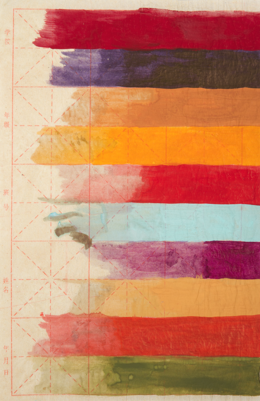
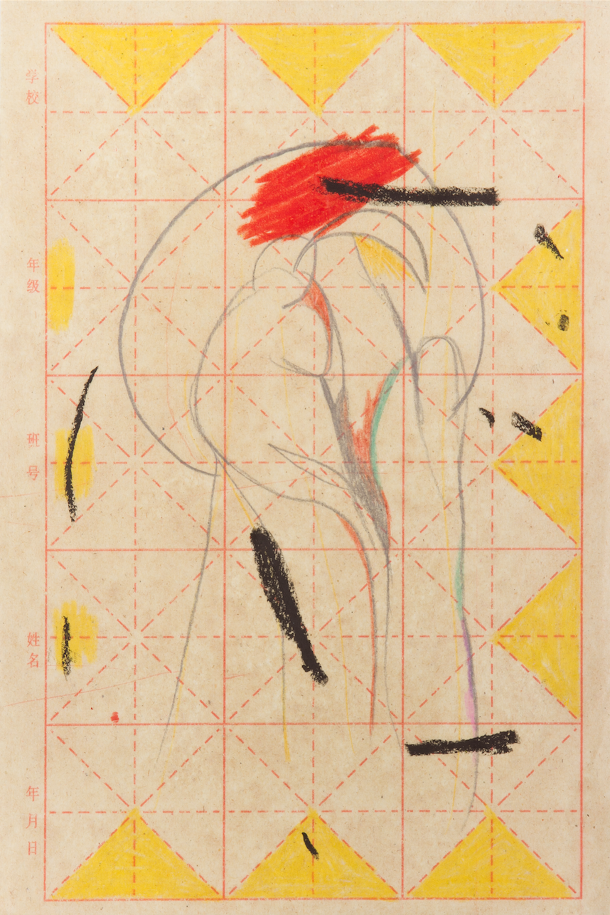
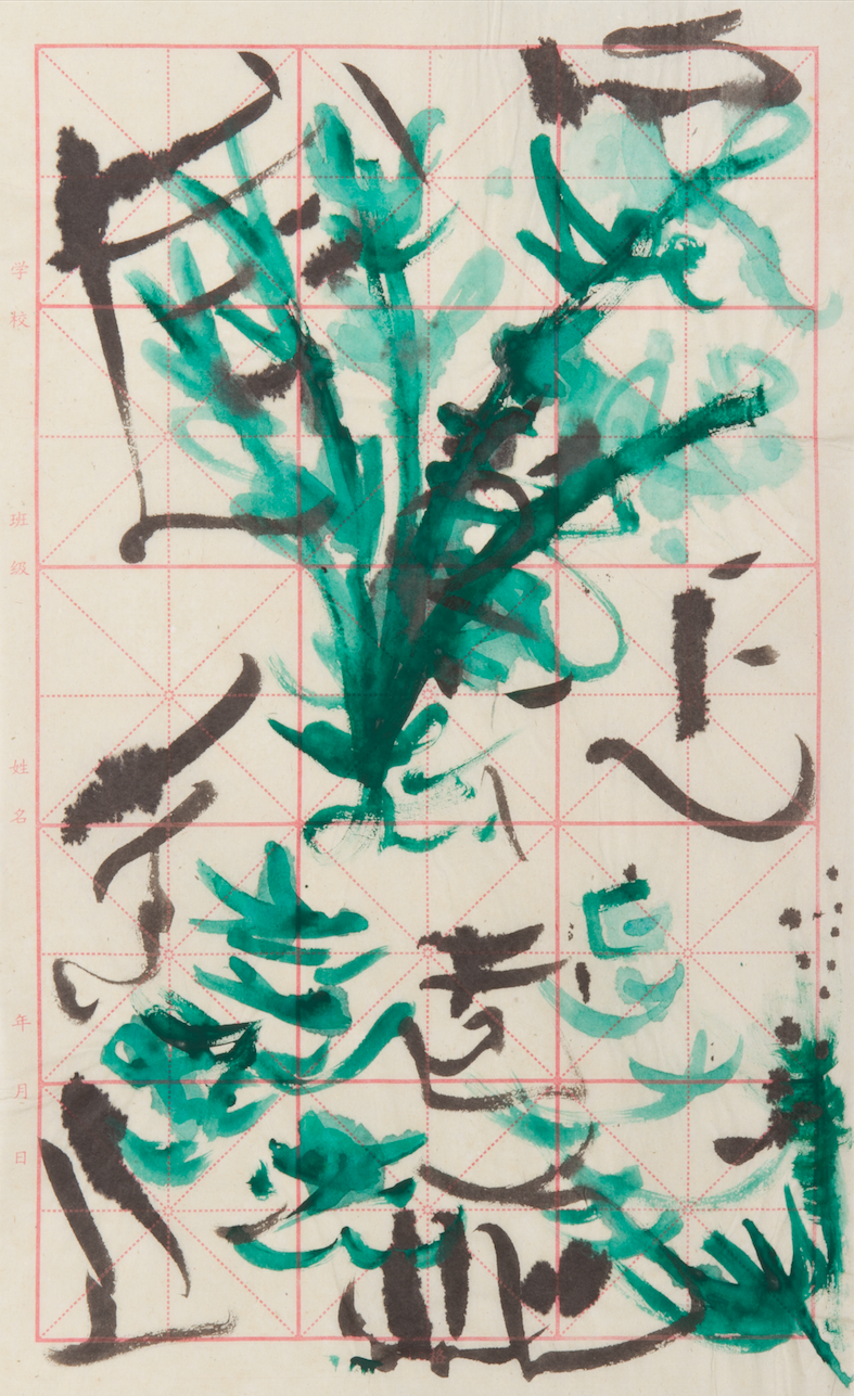
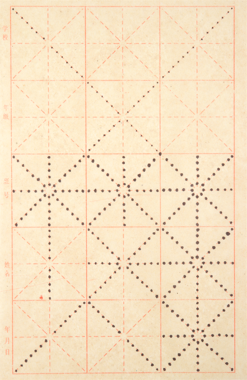
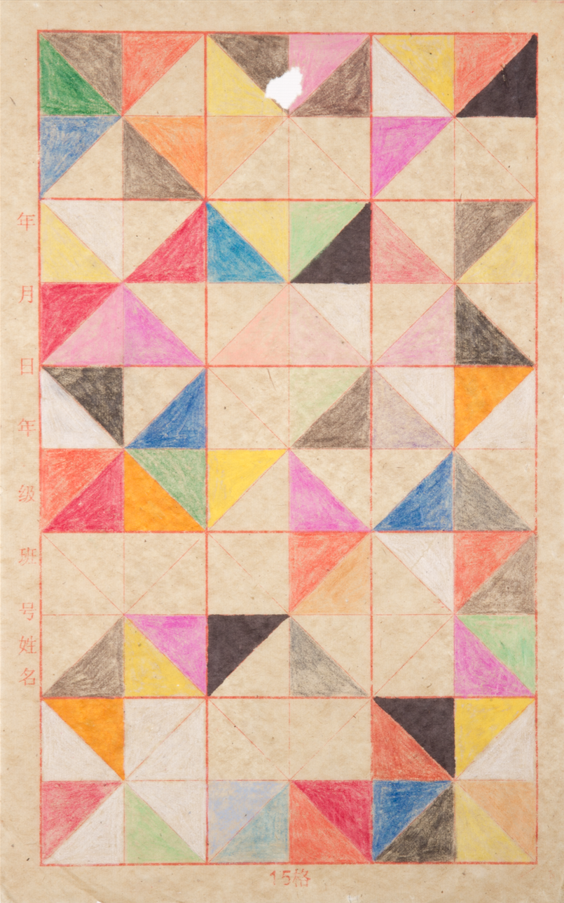
Gala Berger
Wordings
Curated by Marina Reyes Franco
The Wooden Floor, Santa Ana, CA, USA
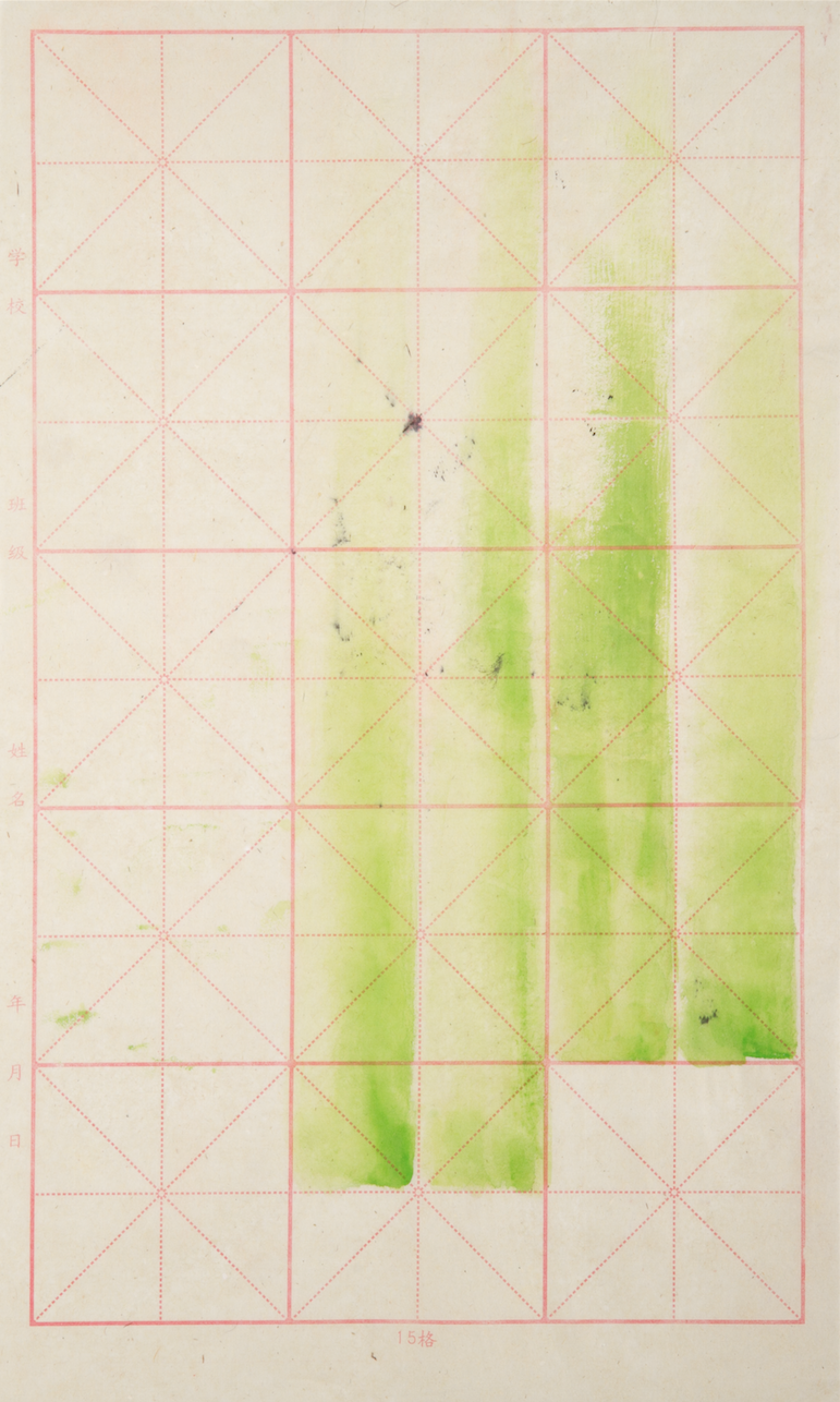
Three years ago, Gala Berger met Lin Hsuan. The patinings that Berger developed afterward, shown as part of the Sayago & Pardon collection at The Wooden Floor, seem playful and abstract yet also tell a story of migration, translation, diplomatic issues, postal bureaucracy and language. The 88 works that make up this exhibition are part of a larger bid at grasping the Chinese language-so visual, poetic, conceptual-through her own art. Painting on Mao bianzhi paper, a tool used at Chinese schools to teach traditional calligraphy, Berger attempts an intuitive approach to language. Part repetitive task, part painting as social practice, Berger knows she can, at best, be a mere translator, but that doesn’t stop her from trying.
Download Brochure | View E-book
—
Gala Berger conoció a Lin Hsuan hace tres años. Las obras que Berger creó posteriormente, actualmente expuestas por la colección Sayago & Pardon en The Wooden Floor, parecen lúdicas y abstractas, sin embargo, cuentan, además, una historia de migración, traducción, burocracia postal, y de trabas diplomáticas y lingüísticas. Los 88 trabajos que componen esta exhibición, son parte de un esfuerzo superior para comprender el idioma chino-tan visual, poético, conceptual-a través de su propia obra. Pintando sobre papel Mao bianzhi, que es utilizado en las escuelas chinas para enseñar técnicas de caligrafía tradicional, Berger intent acercarse intuitivamente al lenguaje. Parte tarea repetitiva, parte pintura como práctica social, Berger sabe que puede, como mucho, ser una mera traductora, pero eso no le impide intentarlo.
Descarga el folleto | Ir a publicación digital


-
- Exhibition view, “Wordings” by Gala Berger, The Wooden Floor, USA, 2013
-
- Exhibition view, “Wordings” by Gala Berger, The Wooden Floor, USA, 2013
-
- Exhibition view, “Wordings” by Gala Berger, The Wooden Floor, USA, 2013
-
- Exhibition view, “Wordings” by Gala Berger, The Wooden Floor, USA, 2013

-
- Exhibition view, “Wordings” by Gala Berger, The Wooden Floor, USA, 2013

-
- Gala Berger, “Chino para principiantes”, 2010-2012, Ink on Chinese calligraphy paper, 14 x 8 1/2 in.
-
- Gala Berger, “Chino para principiantes”, 2010-2012, Ink on Chinese calligraphy paper, 14 x 8 1/2 in.

-
- Gala Berger, “Chino para principiantes”, 2010-2012, Ink on Chinese calligraphy paper, 14 x 8 1/2 in.
-
- Gala Berger, “Chino para principiantes”, 2010-2012, Ink on Chinese calligraphy paper, 14 x 8 1/2 in.
-
- Gala Berger, “Chino para principiantes”, 2010-2012, Ink on Chinese calligraphy paper, 14 x 8 1/2 in.
-
- Gala Berger, “Chino para principiantes”, 2010-2012, Ink on Chinese calligraphy paper, 14 x 8 1/2 in.
-
- Gala Berger, “Chino para principiantes”, 2010-2012, Ink on Chinese calligraphy paper, 14 x 8 1/2 in.

-
- Gala Berger, “Chino para principiantes”, 2010-2012, Ink on Chinese calligraphy paper, 14 x 8 1/2 in.