Artists: Esvin Alarcón Lam, tepeu choc, Diana de Solares, Darío Escobar, Patrick Hamilton.
Overlap/ Traslape
Opens June 1, 2016
The 9.99 Gallery
Guatemala City, Guatemala
Three dialogues are established with three different processes that relate to the idea of overlapping and superimposing elements, time, generations, and actions:
The first dialogue is a interaction in relation to mostly urban landscape in combination with the materials used.
Alejandro Almanza Pereda presents “Horror Vacui (Escena invernal No.1)” [Winter Scene No.1] (2014). From a snowy landscape, Almanza Pereda builds a cement structure that extends beyond the work’s frame to cover the entire wall. The seemingly accidental look of the quasi-action-painting-type dripping acquires a new connotation due to the material and the space extending beyond the painting.
In the same manner, Esvin Alarcón Lam’s “Desplazamiento No.9” [Displacement No.9] (2016) also plays with the space outside the frame. Like a passageway leading to another dimension, the work created out of bus parts establishes an association between the urban landscape and public transportation.
This dialogue ends with tepeu choc’s “Registration No.1” (2016) made out of the plastic material utilized in the informal economy. In it, a series of cut outs call to mind construction tool silhouettes.
The second dialogue is established by the works’s geometric elements such as line, figure, and volume.
Darío Escobar’s “Quetzalcoatl IV” (2004) plays with notions of stability between the undulating bicycle tires, as they surrender their circular shape to gravity laws, and the bronze counterweights.
The piece by Luis Diaz, “The Gukumatz in person” (1971), like Escobar’s work, references the (serpent) deity’s undulating movement: this time in its Quiché appellation, and in a more stable manner derived from flexible wooden sections that adapt to different crawling movements. These sharp forms make a return to verticality in “Chuzo” (2012-2016), a construction-tool-like work by Patrick Hamilton.
In “Sin título” (Untitled) (2015), a drawing by Diana de Solares, assorted color layers generate movement related to air and the kind found in children’s pinwheels. Thus, varying elements of nature come together and overlap in this work.
Finally, the third overlapping dialogue emerges between a spiritual perspective and the physical body. The indigo and turquoise of Sandra Monterroso’s cotton yarn, “Expoliada III” (Despoiled III) (2016) series, colors associated with water, represent the varying tonalities of rainfall through time.
Meanwhile, in Isabel Ruiz’s “Vuelo de las Mariposas” (Flight of Butterflies) (2016 ), the set of opposing crutches reminds us of the body’s fragility: The before-and-after of a transition between what is natural and what the fire has consumed.
In Diego Sagastume’s photographs, we return to the urban landscape of painted walls and open skies whose tonalities show the passage of time, also found in Christian Lord’s “(Mira)anda IV” ((Look)go IV) (2015), a work that through wordplay, invites us to contemplation and to walk, suggested by the circle’s forward movement.
July 8, 2016 tepeu choc: Color Mapping https://abstractioninaction.com/happenings/tepeu-choc-color-mapping/
Artist: tepeu choc
Color Mapping
April 6, 2016 – April 30, 2016
Alianza Francesa Guatemala
Guatemala
By abstracting physical space and transforming it into graphic representations, this is how the art of making maps operates, allowing us to conquer inhospitable territories and to access areas through which we move. In a similar manner the artist tepeu choc (Guatemala, 1983) manages to greatly synthesize the external lines and to render them concrete in the most basic aspects of artistic creation: form and color. He creates new languages for reading these lines transforming them in a occupied area. His titles inform us what he is expressing. From figurative representations that he captures in basic color, following the encapsulation of specific times and their abstractions, to the three-dimensional gain and the reading x-ray style of his sculptures, his work invites us to tour those places, that having become strangers. we are able to re-visit from a new appropriation perspective. Color becomes the basic element for the distinction between lines dividing objects, spaces, and temporality—areas where the artist moves. With only seven basic colors, Tepeu Choc is capable of recreating abstract ideas of distance, or the difference between night and day. Color also becomes referential in his sculptural work in the form of floating threads around the interior and exterior space, without specific distinction. While in his two-dimensional creations he applies the golden mean rule, which allows them to be accessible and pleasing to the eye, in his sculpture he retains a somewhat chaotic element due to the plasticity of the materials with which he works, especially in this exhibition. Thus, the artist’s so-called conquest comes from his real-world knowledge and from the rules of abstraction, which first appear close to an exercise in geometry but in reality is a recomposition of the physical spaces he invites us to get to know.
April 29, 2016 Diana de Solares & Tepeu Choc: La desintegración de la forma https://abstractioninaction.com/happenings/diana-de-solares-tepeu-choc-la-desintegracion-de-la-forma/
Artists: Alfredo Ceibal, Christian Dietkus Lord, David Sánchez, Diana de Solares, Diego Sagastume, Edgar Orlaineta, Ronny Hernández Salazar, Sebastian Preece and Tepeu Choc.
La desintegración de la forma
September 3, 2015
The 9.99 Gallery
Guatemala, Guatemala
Even at its inception and during its heyday in the mid-sixties and early seventies, conceptual art was difficult to define. No one knows who started it, which artist did what and when, what were his or her philosophy, goals and policies. None of those present remember much; each person has its own history and scholars and critics have been left to try to make head or tail out of the movement—among them, many who did not live through those times and did not witness those events. That is why American curator and art critic Lucy R. Lippard in her book Six Years: The dematerialization of the art object from 1966 to 1972 tries to reconstruct that story—readily admitting not being able to rely much on her memory—to give us a context of the artistic era in which she lived. According to Lippard she concentrated her efforts to write “a critical memoir of a small group of young artists’ attempts to escape from the frame-and-pedestal syndrome in which art found itself by the mid-1960s.”
The artists in “La desintegración de la forma” have also looked for ways to express themselves by making art that need not be framed or put on a pedestal; their work is ephemeral, cheap, and unpretentious, where the idea is paramount while the material form is secondary. For example, Diana de Solares’s work made of iron and twisted wires, shoestrings, electrical cords, pieces of pottery and other found materials are veritable poetic tangles, or drawings in space as defined by the Venezuelan artist Gego (1912–1994). They rest directly on the floor or hang from the ceiling, casting dancing shadows on the wall. Rejecting the idea of highlighting the work by placing it on a base or pedestal Solares eliminates that invisible barrier that separates the art from the viewer, thus denying it a special status. The works of Edgar Orlaineta, also suspended from the ceiling like a Calder mobile, have the appearance of a three-dimensional puzzle with each element playing a vital role in the final composition. In contrast to Solares’s sculptures that deal with formal aspects, the materials employed by Orlaineta are selected based on the artist’s interest in the work of American graphic designer Alvin Lustig (1915-1955), and more specifically in the book covers that Lustic designed for the publishing house New Directions during the 1940s. Although you’d think that the focal part of the piece is the narrative contained in the book that is included in each of the works and whose title provides the name for the work (in this case A Season in Hell, from the series New Directions, 2015), what actually counts for Orlaineta is the modernist design of its cover with its harmonic composition, its emphasis on abstraction and complementary colors, and its minimal use of typography. It was this rigor that gave fame to Lustig, who believed that good design should permeate all aspects of a person’s life, an idea that persists until today in the belief that form is important in the functionality of design in general.
The graphic design of the magazine covers is barely glimpsed in the work of Christian Dietkus Lord who obscures them with a series of painted circular compositions based on the Zen practice of Ensō painting. This practice dictates that the circle should be drawn with a single stroke, which once made cannot be altered. The gesture highlights the character of its creator and the context of its creation in a short and contiguous period of time. Traditionally this type of painting is done in black ink on very thin white paper. In Northern Shell ( 2011) Dietkus Lord uses a variety of colors to draw concentric circles deliberately obscuring the text that reveals the magazines’ content, including Attitude, a magazine that specializes in articles about homosexuality as a way of life for a post-AIDS generation.
The irregular circles that appear in the Transparencies (2015) of Alfredo Ceibal have their origin in the craters of volcanoes and the lakes that form inside them. The artist defines these shapes as “abstract mantras,” and depending on the limpidness of the body of water, they can be defined as “benign pools” or “malignant pools.” They are also places that invite meditation for their altitude and geographical location, as well as for their exuberant and less contaminated nature that make us feel part of a cosmic whole and of a world at peace. Ceibal’s series of drawings entitled Dialogues (2015) represents vague human forms of communication. According to the artist they denote different types of conversations that take the form of “language, ritual, dance, music, literature, body language, and the gaze, to understand each other.” To Ceibal “the great value of dialogue can not be underestimated as it is the crucial component for communication and equality in human relations.”
Communication so important for the proper functioning of society is interrupted in the work of Ronny Hernández Salazar. Vol-can (2014) is a file cabinet with open drawers filled with sand. The accumulation has formed a heap of sand, in the form of a volcano, burying the papers supposed to be archived there. Vol-can is a metaphor for the lack of justice; it represents court cases that have been forgotten, suspended in time, waiting for a judgment that may never come. The fragility of life is reflected in El final de las palabras (The end of words, 2004) by David Sánchez in which air produced by a fan spreads marble dust over the floor forming a thin white layer upon which visitors leave foot track made while walking on it. With its continued air movement the fan erases them so that others can make them again. To record and to erase is an exercise that could be repeated ad infinitum where the human presence is evidenced on a marble dust canvas analogous to the tombstones that accompany the graves. Other artists in the exhibition are Diego Sagastume with images showing the moisture condition of the asphalt, a time-ravaged wall, and rust on a ventilation duct that reflects a sunset, and a cast concrete floor; Sebastián Preece with a photograph of a decomposed book that was part of an important library but its disappearing due to neglect and the passing of time; and Tepeu choc with a work made of sift mesh and colored threads, a work he describes as the X-ray of a sculpture. Forms of communication, pseudo-alphabets, font types, abstractions that overflow, fragile materials that disappear over time, these are some of the ongoing concerns of the artists in “La desintegración de la forma.”
September 14, 2015 tepeu choc, Aníbal López A-1 53167 & Antonio Pichillá: The Thin Line https://abstractioninaction.com/happenings/tepeu-choc-anibal-lopez-1-53167-antonio-pichilla-thin-line/

Artists: Mauricio Esquivel, Adam Winner, Esvin Alarcón Lam, Marilyn Boror, tepeu choc, Jorge Linares, Aníbal López A-1 53167, Antonio Pichillá, Gabriel Rodríguez, Diego Sagastume, Inés Verdugo.
The Thin Line
October 16, 2014
The 9.99 Gallery
Guatemala City, Guatemala
The exhibition will show the work of the artists Mauricio Esquivel (El Salvador), Adam Winner (USA), Esvin Alarcón Lam, Marilyn Boror, Tepeu Choc, Jorge Linares, Aníbal López (A-1 53167), Antonio Pichillá, Gabriel Rodríguez, Diego Sagastume, Inés Verdugo (Guatemala).
October 9, 2014 Artists: Dario Escobar, Diana de Solares, tepeu choc & Patrick Hamilton: Height x Width x Depth https://abstractioninaction.com/happenings/artists-dario-escobar-diana-de-solares-tepeu-choc-patrick-hamilton-height-x-width-x-depth/
Artists: Dario Escobar, Diana de Solares, Diego Sagastume, Esvin Alarcón Lam, Sandra Monterroso, tepeu choc, Alejandro Almanza Pereda, Carolina Caycedo and Patrick Hamilton.
Height x Width x Depth
July 31, 2014
The 9.99 Gallery
Guatemala City, Guatemala
Group exhibition celebrating one year anniversary of The 9.99 Gallery.
July 18, 2014 tepeu choc https://abstractioninaction.com/artists/tepeu-choc/Translated from Spanish
The constant elements in my work are color, space and form, departing from understanding that, by dedicating to bidimensionality I will never achieve tridimensionality. This compels me to carefully study the space that is available to me, to situate shapes, to build with available elements and materials. From the sketch, I begin the process of the work in which I do not allow changes or improvisations, since I depart from a series of studies on movement, color portions, distance and color. I appropriate existing forms; I modify them and give them a new role, in addition to use the materials which I work with in my favor—thread, wire mesh, color pencils, etc. I am interested in the connection with the viewer, through the play of dimensions of the medium of my work, as well as the application of my palette of colors in different tonalities. Until this day, I have been working with different branches of the visual arts, focusing in some of them, for example drawing, engraving, painting, sculpture and photography. Nevertheless, one of my most ambitious projects, which began in 2008, is the one where I aim to take the dimensional to sculptures that are interact with the public.
Las constantes en mi trabajo son el color, el espacio y la forma, parto de la comprensión de que al dedicarme a la bidimensionalidad nunca podré lograr la tercera dimensión, esto me obliga a estudiar detenidamente el espacio del que dispongo, a situar las formas, construir con elementos y materiales disponibles, a partir del boceto empiezo el proceso de la pieza en el cual ya no admito cambios ni improvisaciones ya que parto de una variedad de estudios de movimientos, porción de colores, distancias y colores. Me apropio de formas que ya existen, las modifico y les doy un nuevo carácter, además de utilizar a mi favor los materiales con los que trabajo, hilo, metal reticulado, lápices de colores, etc. Me interesa la conexión con el espectador, a través del juego de dimensiones del soporte de mi trabajo, además de la aplicación de mi paleta de colores en diversas tonalidades. Hasta ahora trabajo varias ramas de las artes plásticas enfocándome en algunas de ellas como, dibujo, grabado, pintura, escultura y fotografía, sin embargo uno de mis proyectos más ambiciosos el cual ha sido iniciado desde el 2008 en el que pretendo llevar de lo dimensional a esculturas interactivas con el público.
Selected Biographical Information
Education / Training
- Institución escuela nacional de artes plásticas Rafael Rodríguez Padilla, Título bachiller en artes plásticas especializado en escultura, Ciudad Guatemala.
Solo Exhibitions
- 2013: “Proceso”, Guatemala.
Group Exhibitions
- 2013: “Y entonces…”, Guatemala.
- 2013: “Cinco días abiertos”, Guatemala.
- 2011: “Walter Benjamín”, Guatemala.
- 2011: “Tercer salón nacional del grabado”, Guatemala.
- 2010: “Asistentes del festival de escultura Guatemala inmortal”, Guatemala.
Collections
- Grand Forks, North Dakota, USA.
- Sayago & Pardon, California, USA.
-
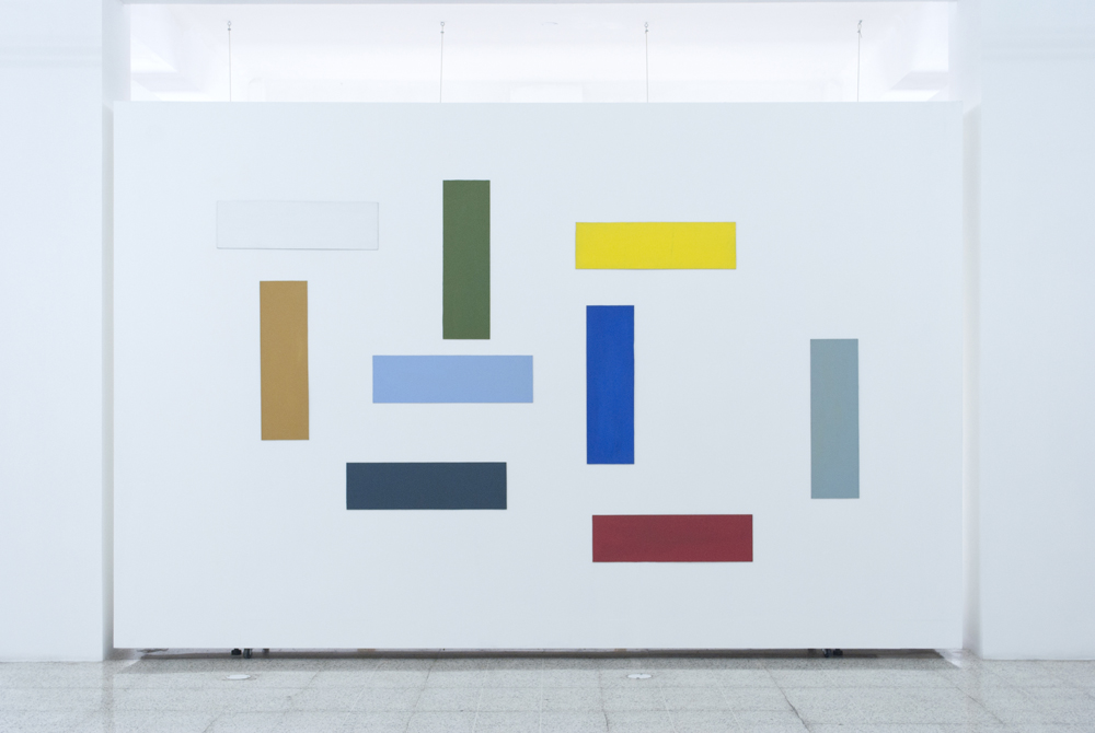
- tepeu choc, “Tres x dos”, 2008, Series: única, Acrylic on cardboard, 35.5 x 23.5 in. (90 x 60 cm). Image courtesy of the artist.

-
- tepeu choc, “Unidad 2”, 2008, Series: estudios del color, Acrylic on MDF, 29.5 x 19.5 in. (75 x 50 cm). Image courtesy of the artist.

-
- tepeu choc, “Teatro”, 2008, Series: estudios del color Acrylic on MDF, 29.5 x 19.5 in. (75 x 50 cm). Image courtesy of the artist.
-
- tepeu choc, “Cantada”, 2008, Series: estudios del color, 29.5 x 19.5 in. (75 x 50 cm). Image courtesy of the artist.

-
- tepeu choc, “El sol por la ventana”, 2008, Series: estudios del color, Acrylic on MDF, 29.5 x 19.5 in. (75 x 50 cm). Image courtesy of the artist.

-
- tepeu choc, “Gran distancia”, 2008, Series: estudios del color, Acrylic on MDF, 29.5 x 19.5 in. (75 x 50 cm). Image courtesy of the artist.
-
- tepeu choc, “Tercera crucifixión”, 2008, Series: estudios del color, Acrylic on MDF, 29.5 x 19.5 in. (75 x 50 cm). Image courtesy of the artist.
-
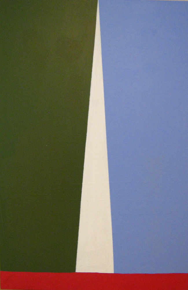
- tepeu choc, “Espacio y equilibrio”, 2011, Series: el aumento de la línea en el espacio blanco, Acrylic on Canson paper, 47 x 31.5 in. (120 x 80 cm). Image courtesy of the artist.

-
- tepeu choc, “A (amgdt)”, 2008-2012, Series: tipografías, Digital print and acrylic on canvas, 59 x 39 in. (150 x 100 cm). Photo credit: Karen Estrada

-
- tepeu choc, “Z (amgdt)”, 2008- 2012, Series: tipografías, Digital print and acrylic on canvas, 59 x 39 in. (150 x 100 cm). Photo credit: Karen Estrada
-
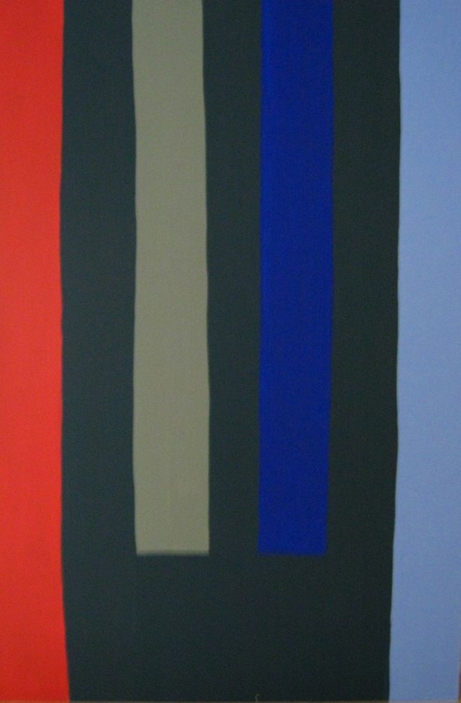
- tepeu choc, “No. 5”, 2013, Series: el aumento de la línea en el espacio negro, Acrylic on canvas, 59 x 39 in. (150 x 100 cm). Photo credit: Karen Estrada

-
- tepeu choc, “No. 6”, 2013, Series: el aumento de la línea en el espacio negro, 59 x 39 in. (150 x 100 cm). Photo credit: Karen Estrada

-
- tepeu choc, “No. 3”, 2011, Series: radiografía de escultura primera fase, wire mesh, color threads and acrylic, 16.5 x 15 x 13.5 in. (42 x 38 x 34 cm). Image courtesy of the artist.

-
- tepeu choc, “O marlet”, 2008-2010, Series: tipografías, Serigraphy on color papers, 73 x 49 in. (185 x 124 cm). Image courtesy of the artist.

-
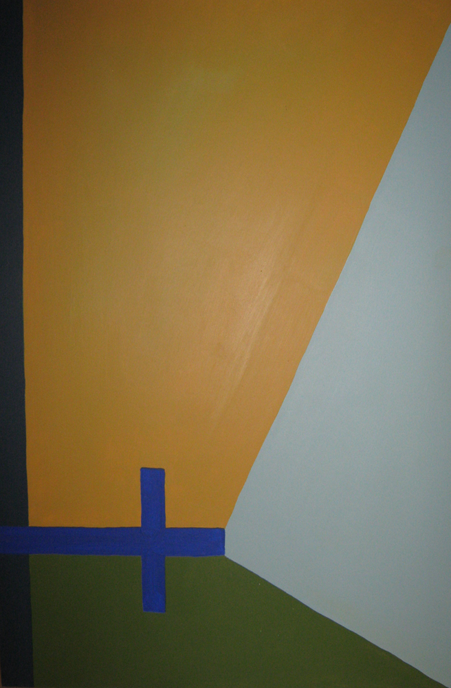
- tepeu choc, “Fracción de elementos”, 2008, Series: única, Acrylic on MDF, 29.5 x 19.5 in. (75 x 50 cm). Image courtesy of the artist.